
Twilight at Taronga
For Twilight at Taronga 2026, I was commissioned to create the key visual for Taronga Zoo’s much-loved summer concert series.
The artwork needed to celebrate Australian wildlife, support Taronga’s conservation message, and create a flexible visual system that could adapt across digital, print, signage, merchandise, and the live event environment, where the illustration was used across the stage and surrounding campaign assets.
I developed the illustration from early composition studies through to final rendering, colour direction, and a modular suite of assets designed for rollout across the wider campaign.
Shaping the composition
The first stage focused on finding the right balance between storytelling, wildlife, and campaign functionality.
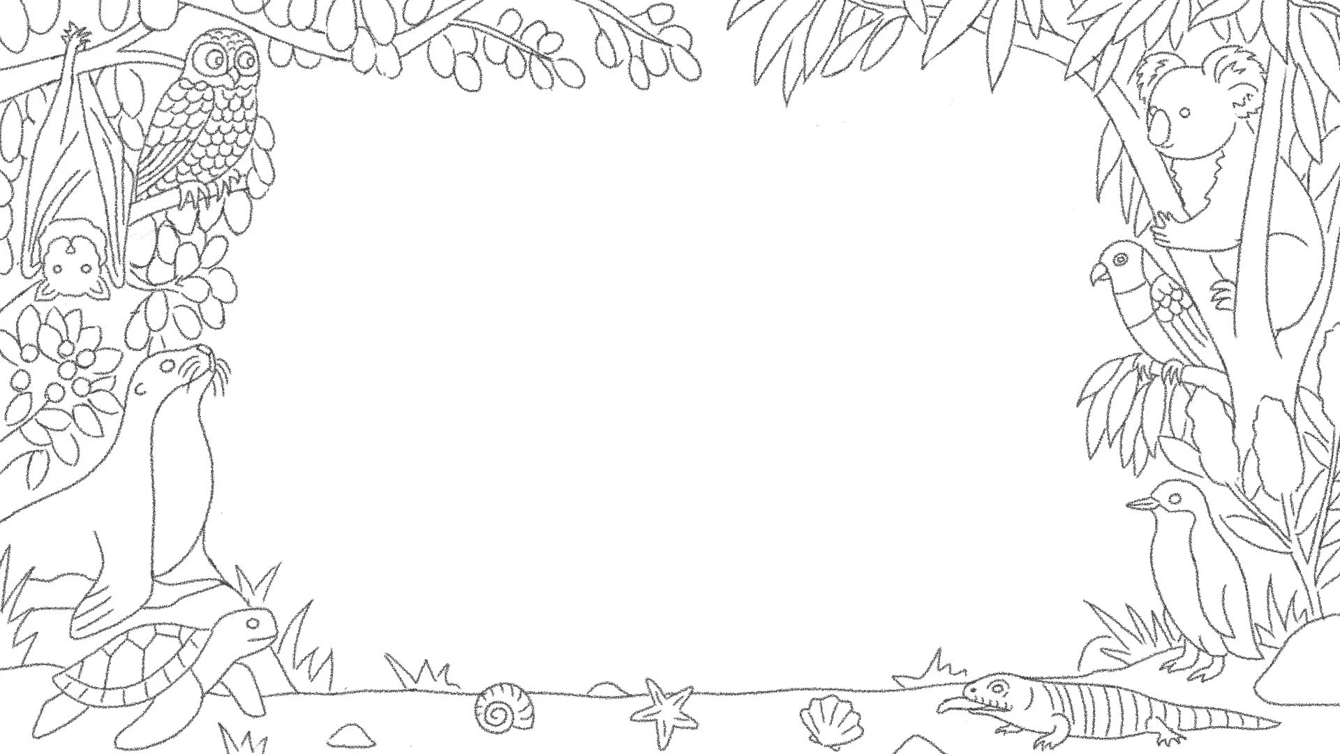
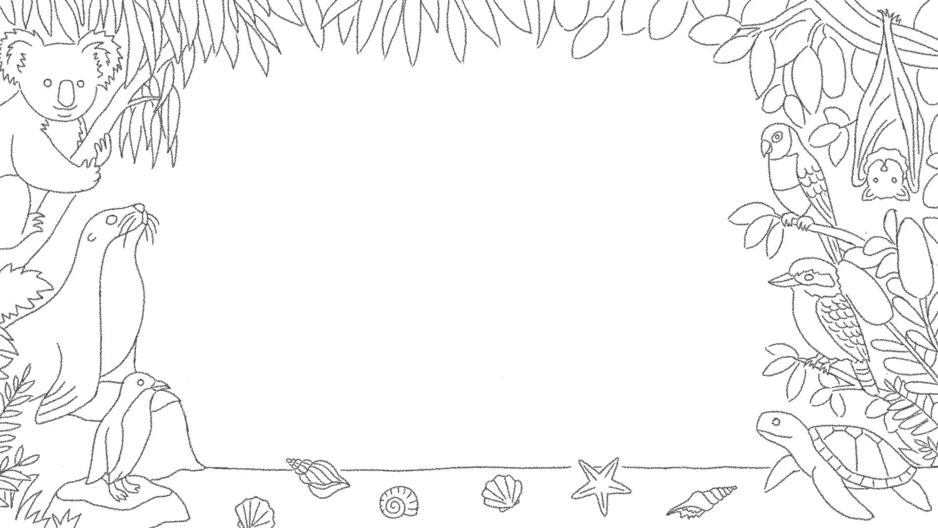
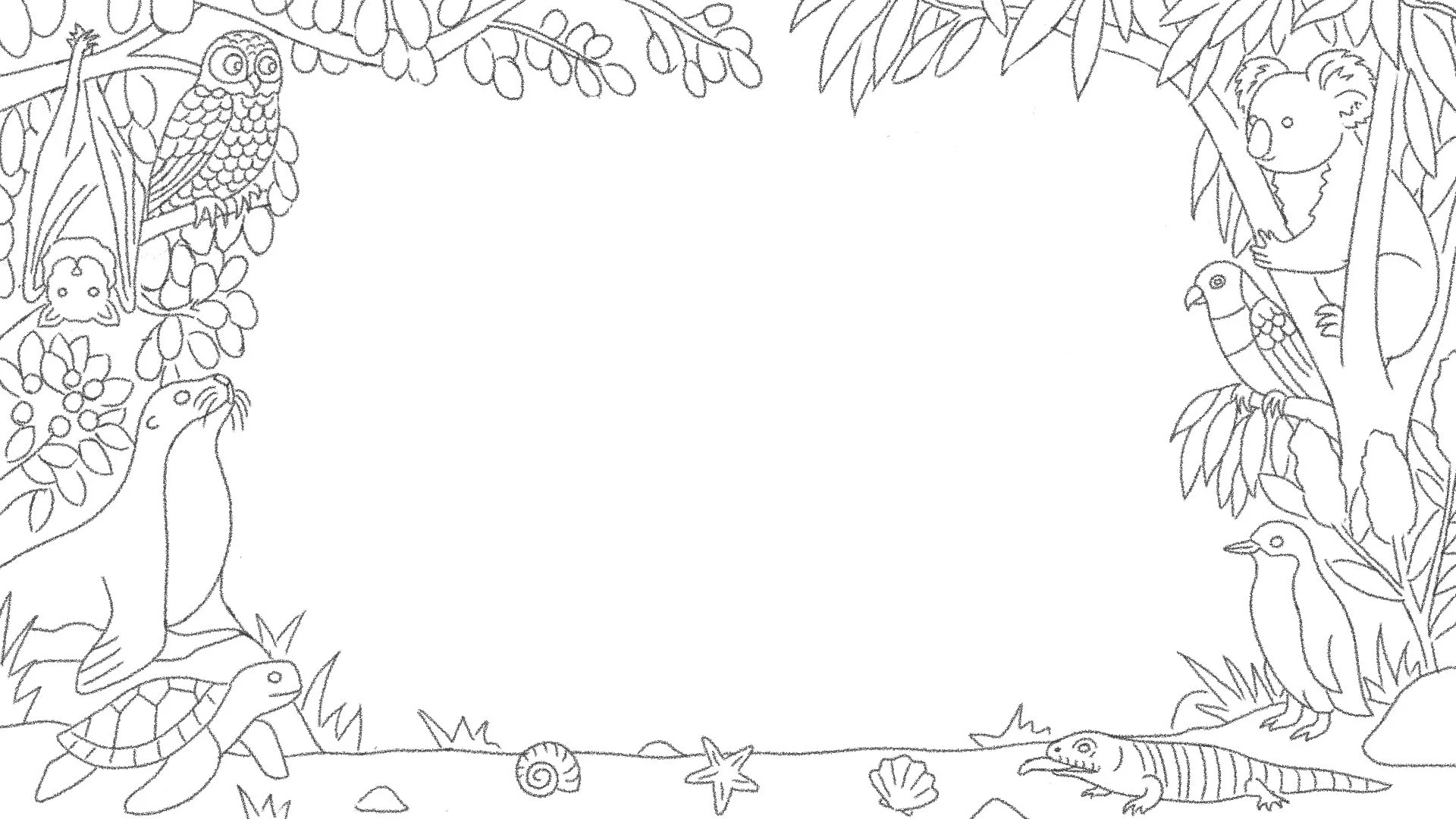
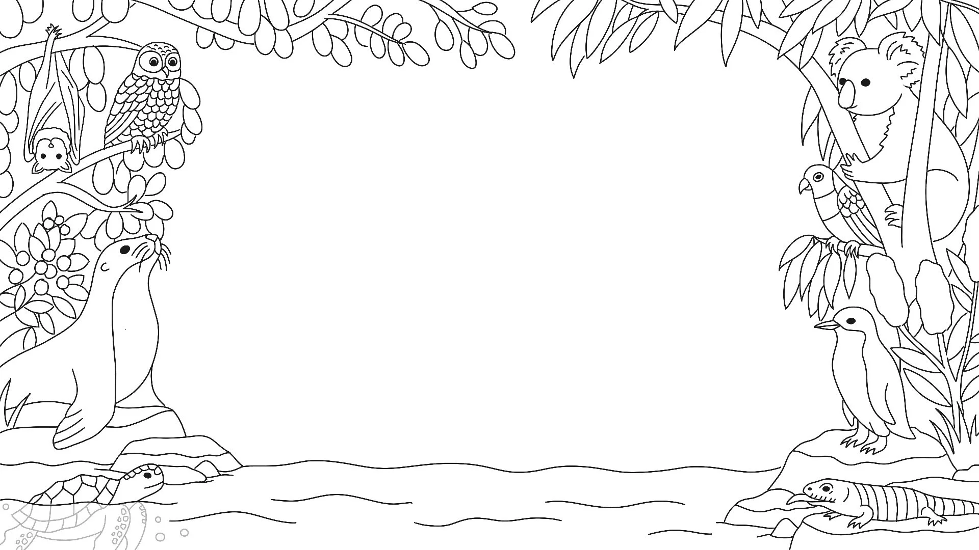
I explored three compositions, each using native flora and fauna to create a natural frame around the central content area. The concepts varied in density and hierarchy, from a richer, more immersive scene to a more pared-back layout with greater emphasis on the hero species and more negative space for messaging.
From the outset, the composition needed to do more than look engaging. It also had to accommodate event information, sponsor logos, and future campaign applications without losing clarity.
Refining the concept
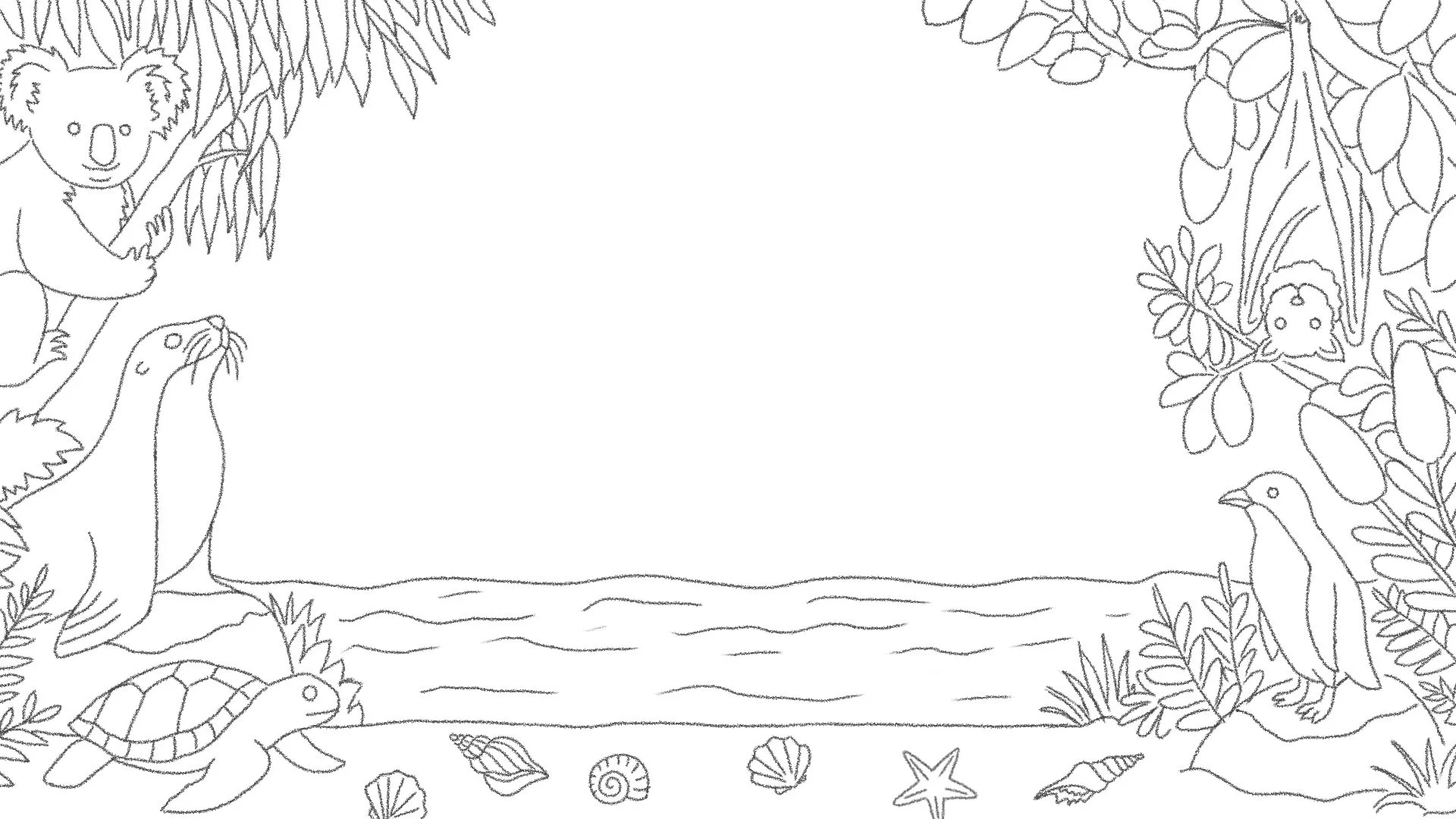
The selected direction was developed collaboratively with Taronga, with each round balancing visual storytelling, campaign functionality, and ecological accuracy.
Feedback informed details such as animal scale, habitat, and behaviour, as well as practical considerations around content and sponsor placement. The flying fox and lorikeet were resized, the blue-tongue lizard was repositioned to better reflect its environment, and the loggerhead turtle was adjusted to more accurately represent its behaviour within the scene. The lower portion of the composition also evolved from sand and shells to open water, creating more flexibility for campaign content.
These refinements helped the artwork feel both credible and expressive, while keeping the central space clear and adaptable.
Developing the palette
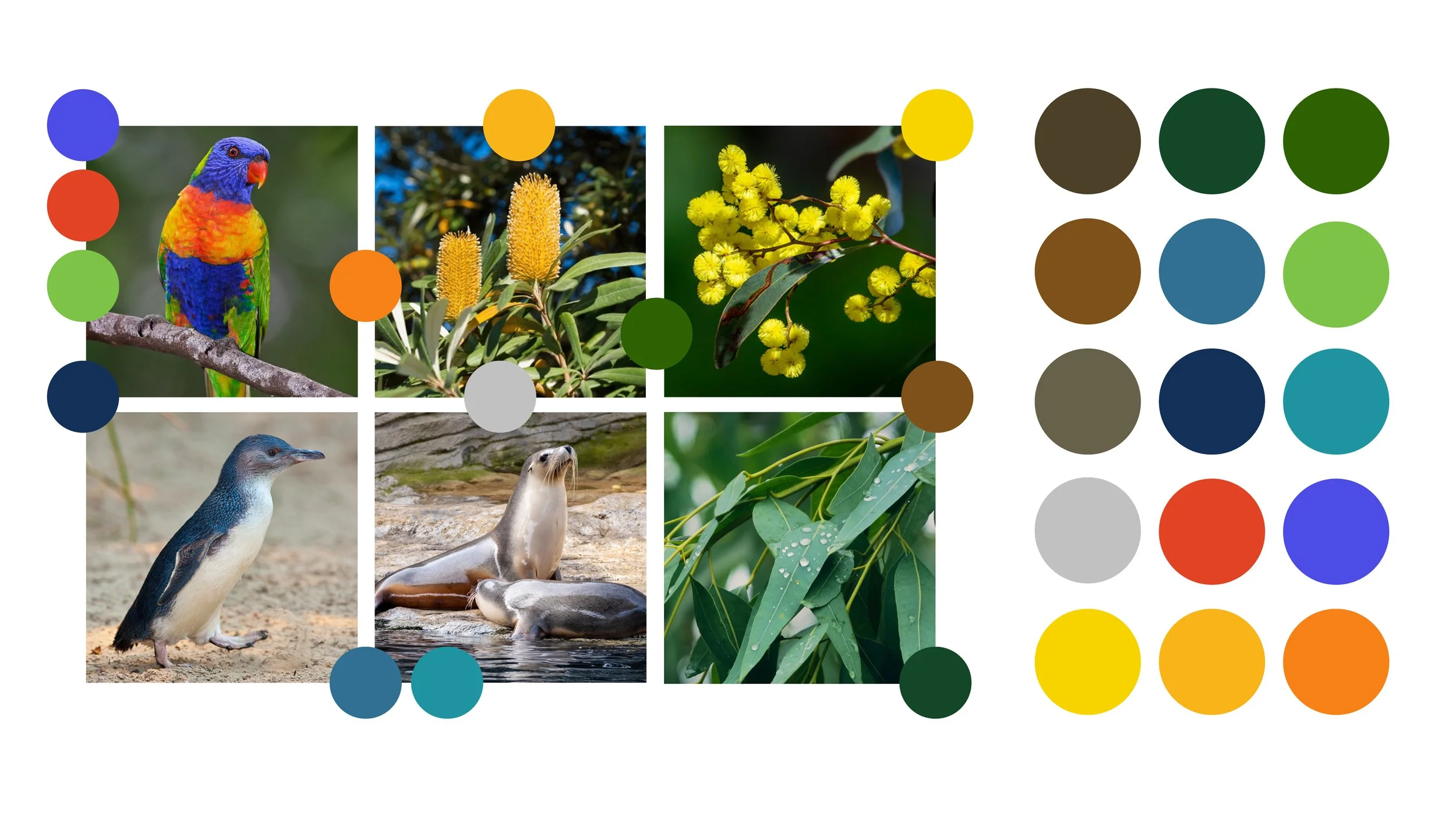
The initial colour palette was drawn from the native flora and fauna featured in the illustration, combining earthy greens, coastal blues, warm ochres, and brighter accents inspired by Australia’s wildlife.
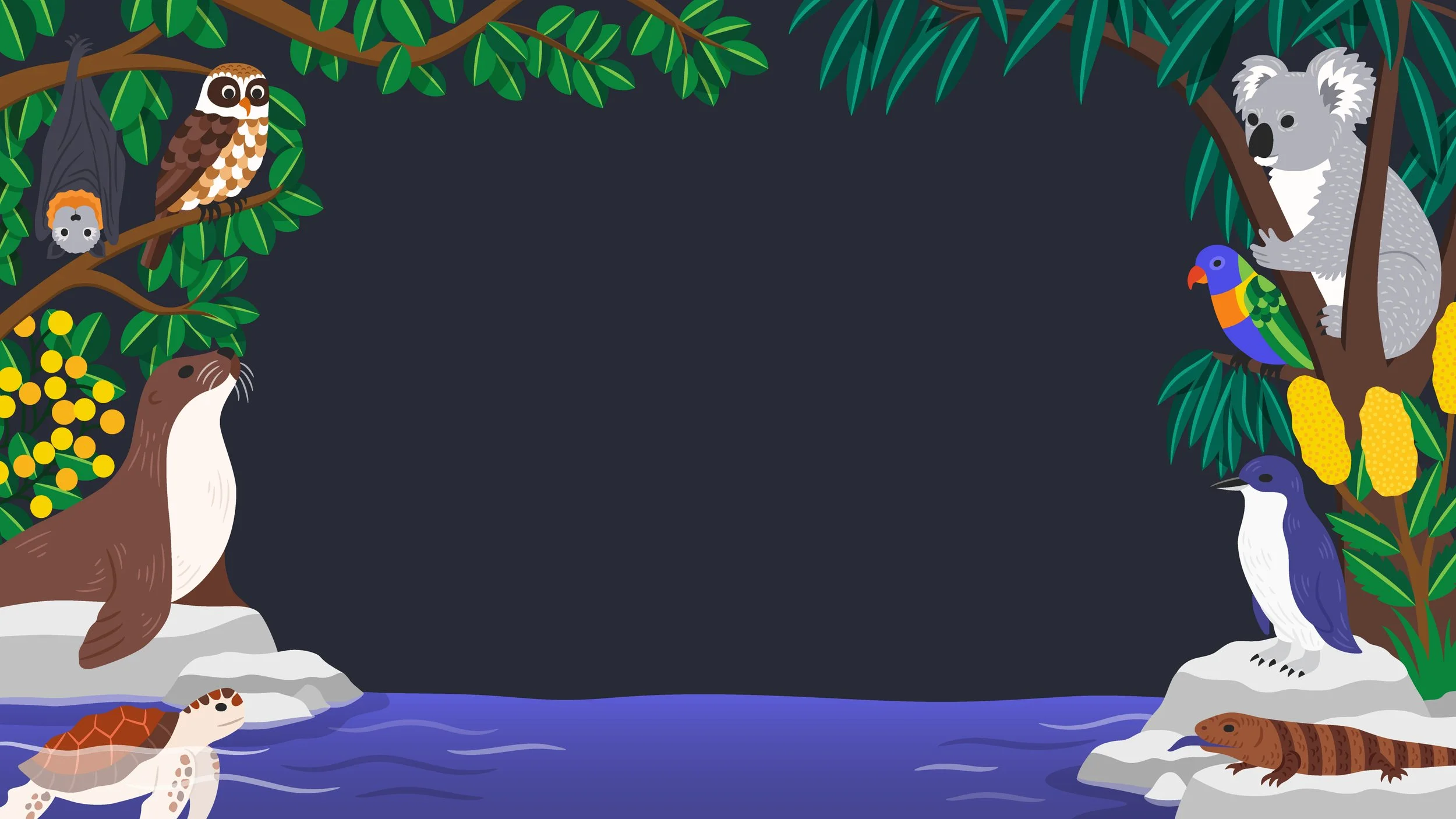
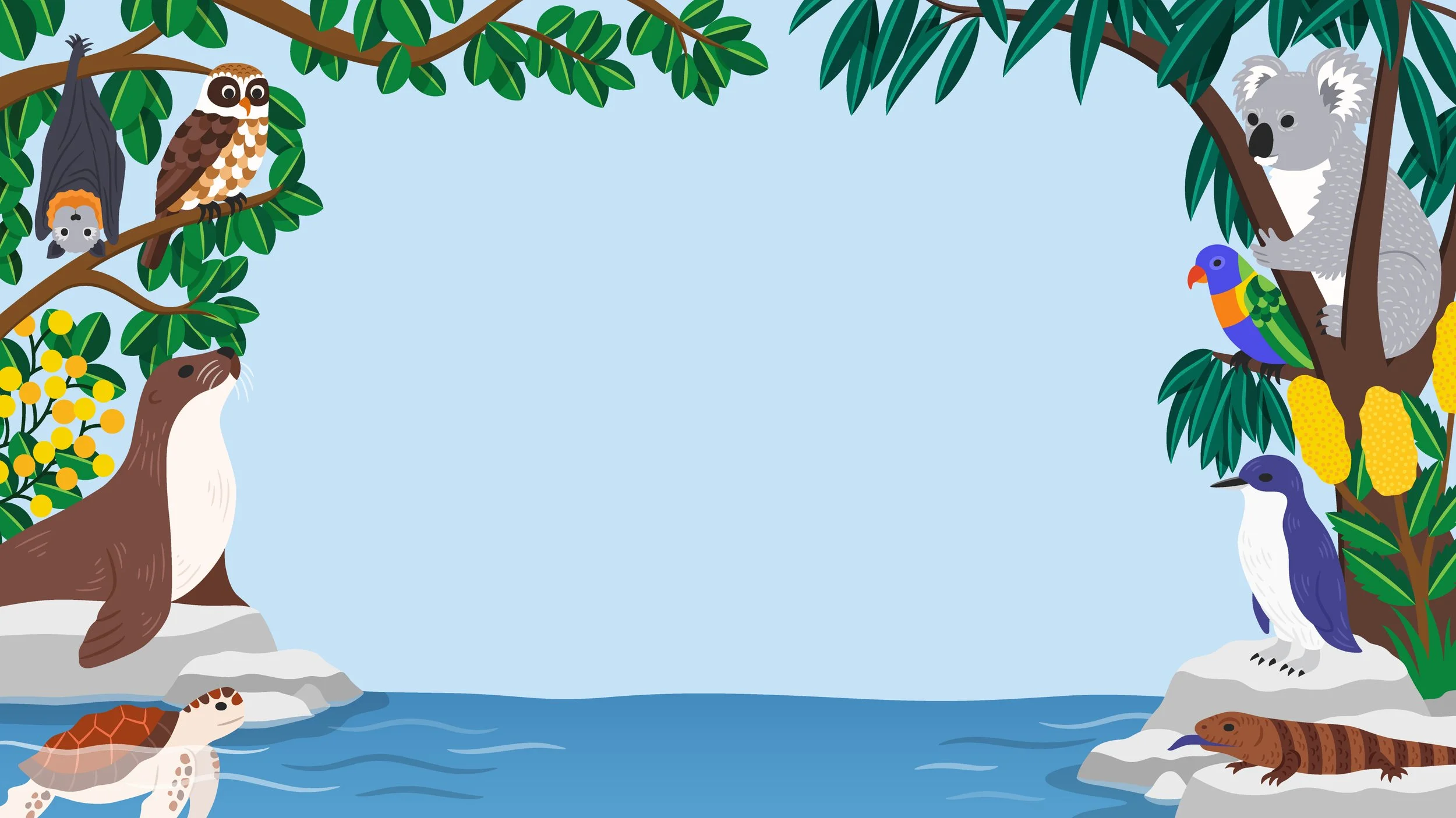
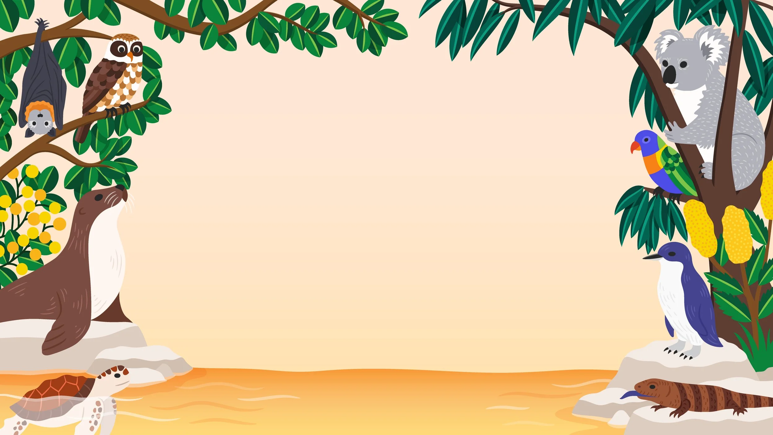
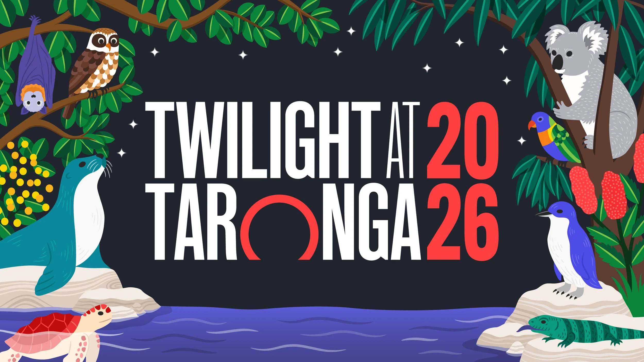
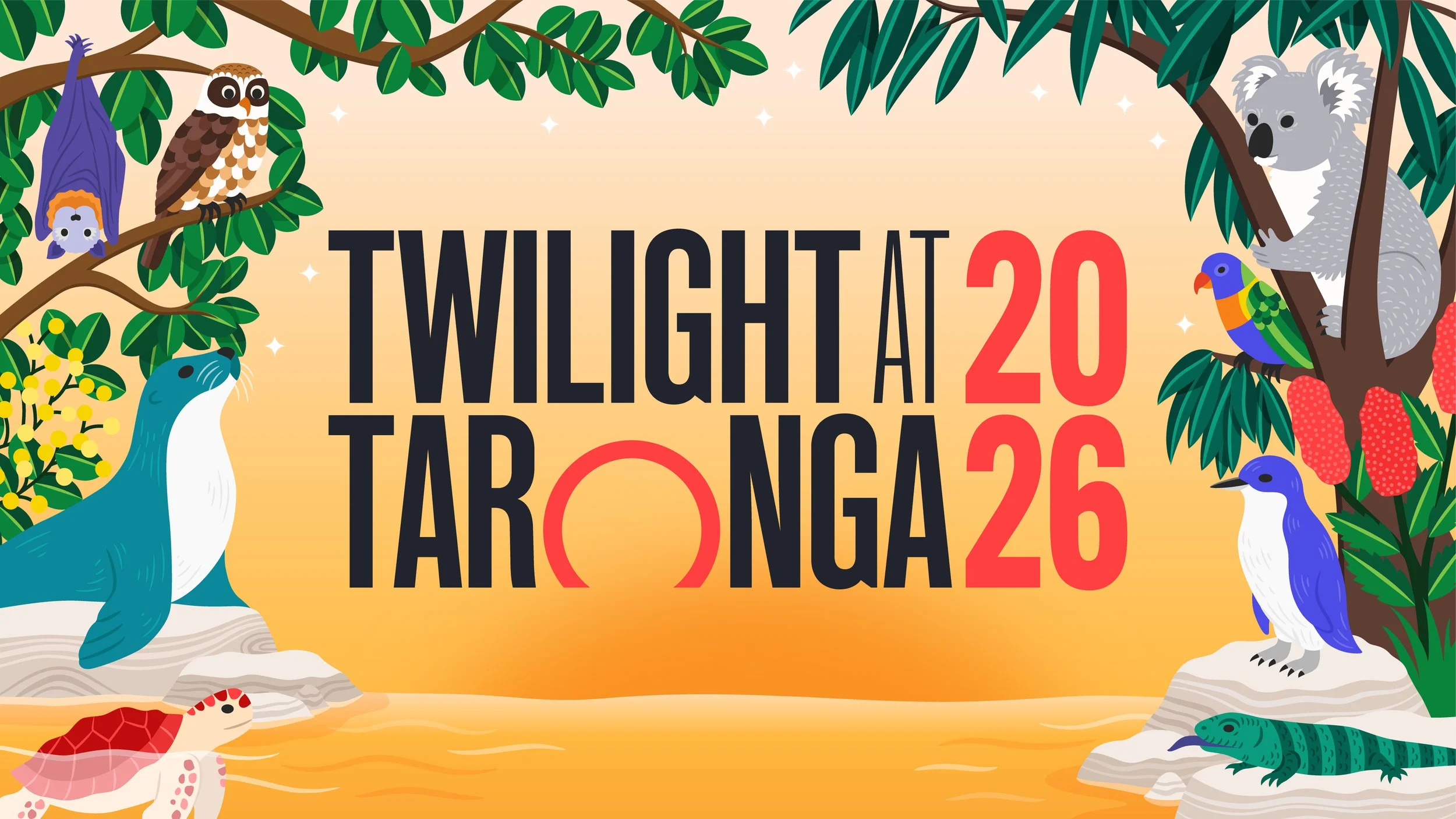
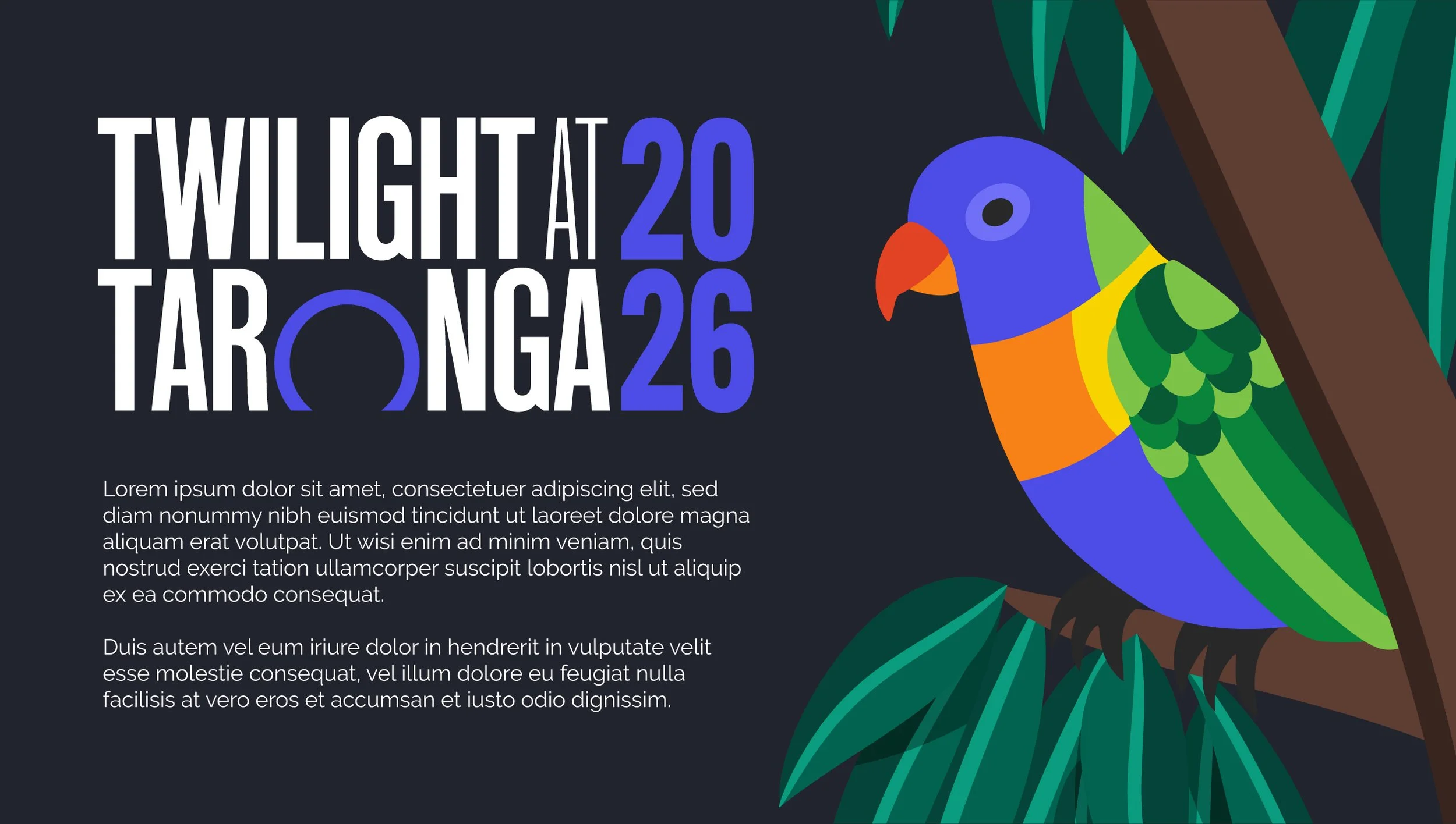
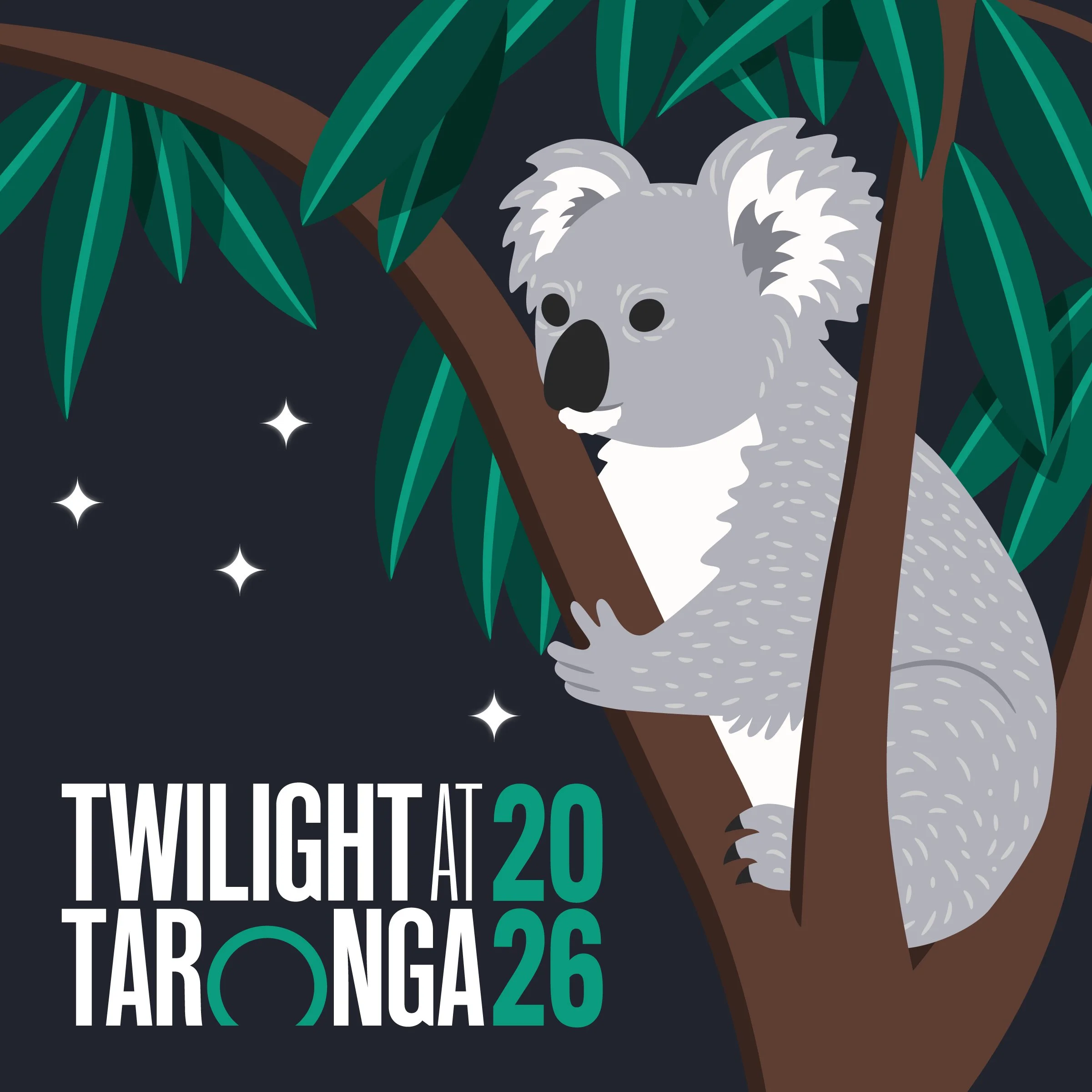
Following the first render, Taronga asked to explore two directions further: a deeper night time treatment and a richer golden hour version, with both incorporating some brighter, more stylised colour across the animals rather than relying entirely on naturalistic tones.
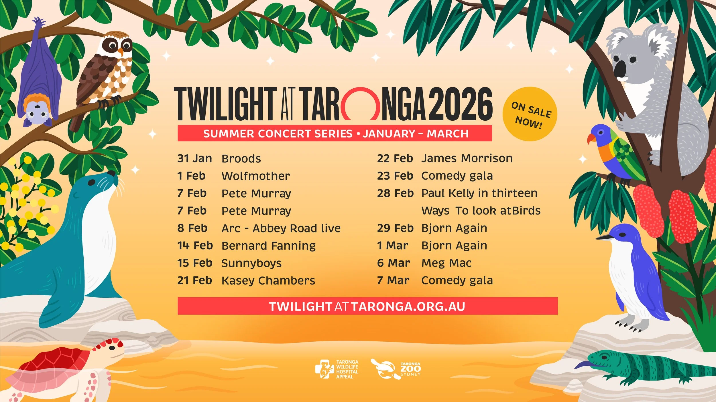
The Golden Hour concept was developed into a warmer, more atmospheric hero treatment, using a richer sunset backdrop to capture the feeling of a summer evening at Taronga. This became the final campaign direction selected by the client.
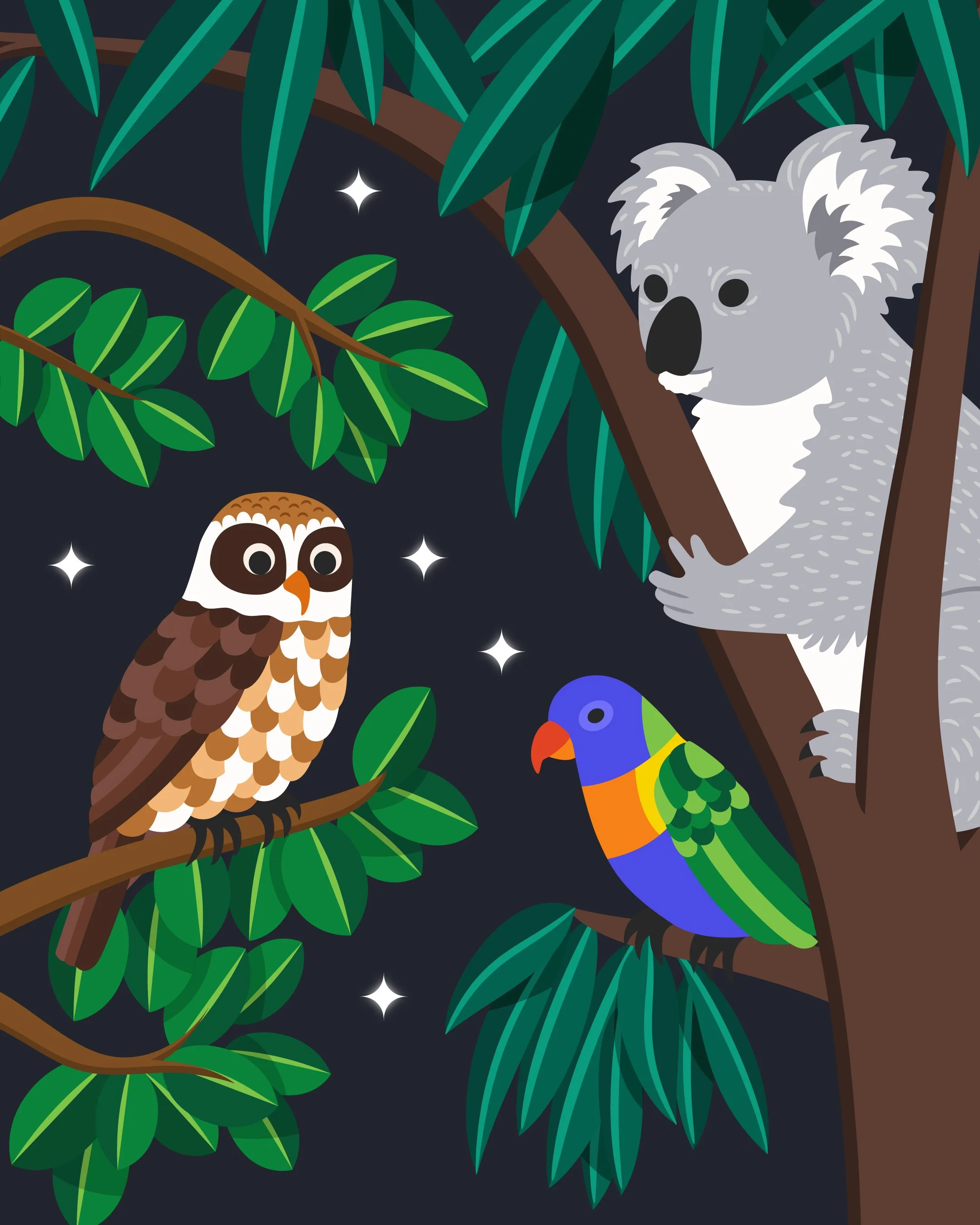
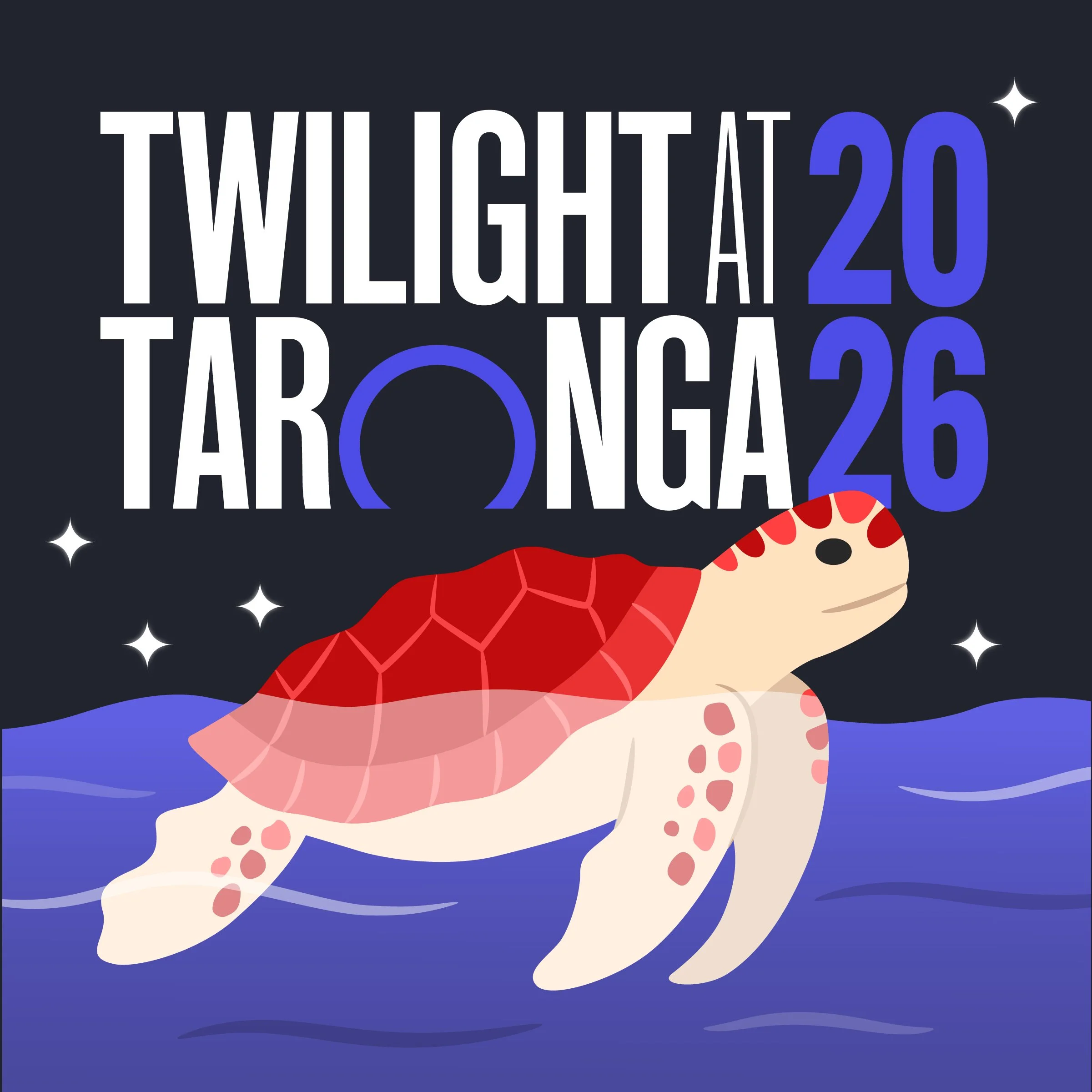
The night time version was refined alongside it as an alternative treatment, offering stronger contrast and additional flexibility across campaign applications where a darker background or more dramatic evening mood was useful.
Together, the two colourways gave the campaign a consistent illustrated language with enough flexibility to adapt across different formats, settings, and rollout needs.
Designing for campaign rollout
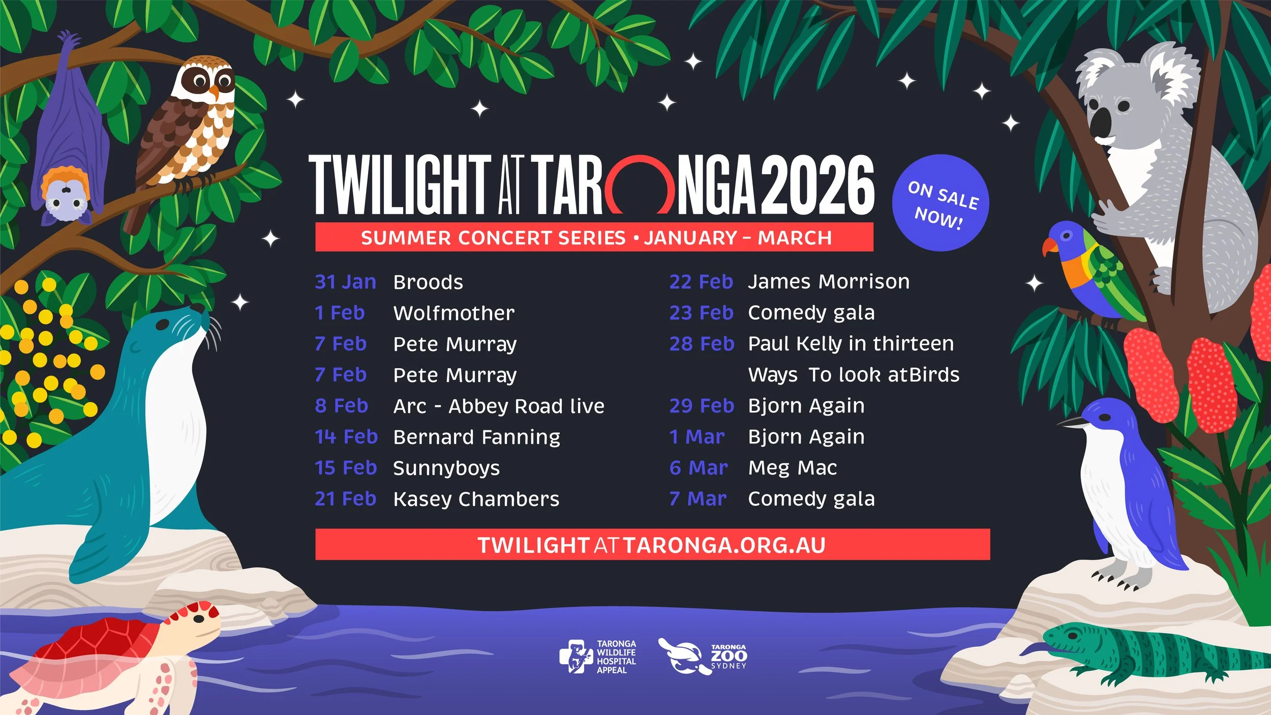
The key visual was designed as a flexible system rather than a single fixed composition.
Each animal and supporting element was rendered in full so it could be reused independently, cropped, rearranged, animated, or incorporated into new layouts while maintaining a consistent visual language.
This modular approach made the artwork adaptable across social content, event signage, web banners, merchandise, and large-format applications, giving Taronga a broader library of illustrated assets to work with throughout the campaign.
Bringing Twilight at Taronga to life
The final campaign brings together Australian wildlife, native flora, and the atmosphere of a summer evening at Taronga in a flexible visual system designed to work across a wide range of applications.
The richer Golden Hour treatment was selected as the hero direction, while the darker night time version provided an alternative colourway for greater campaign flexibility. Across both, the modular illustration system allowed individual animals and supporting elements to be reused, rearranged, and adapted without losing the overall visual identity.
Seeing the artwork carried through into the live event was a particularly rewarding part of the project, with the illustration extending across the stage, banners, signage, and wider campaign environment.
The result is a cohesive campaign world that celebrates the species at the heart of Taronga, supports its conservation message, and moves comfortably from digital and print into large-scale, real-world application.