Sorbido
Sorbido is a playful brand concept built around a bespoke illustration and identity system designed to communicate culture, character, and authenticity.
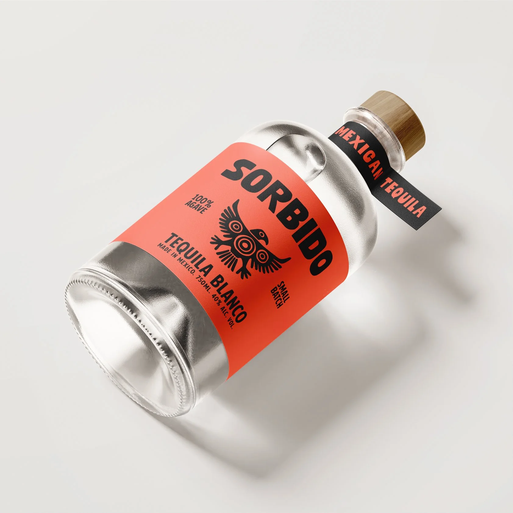
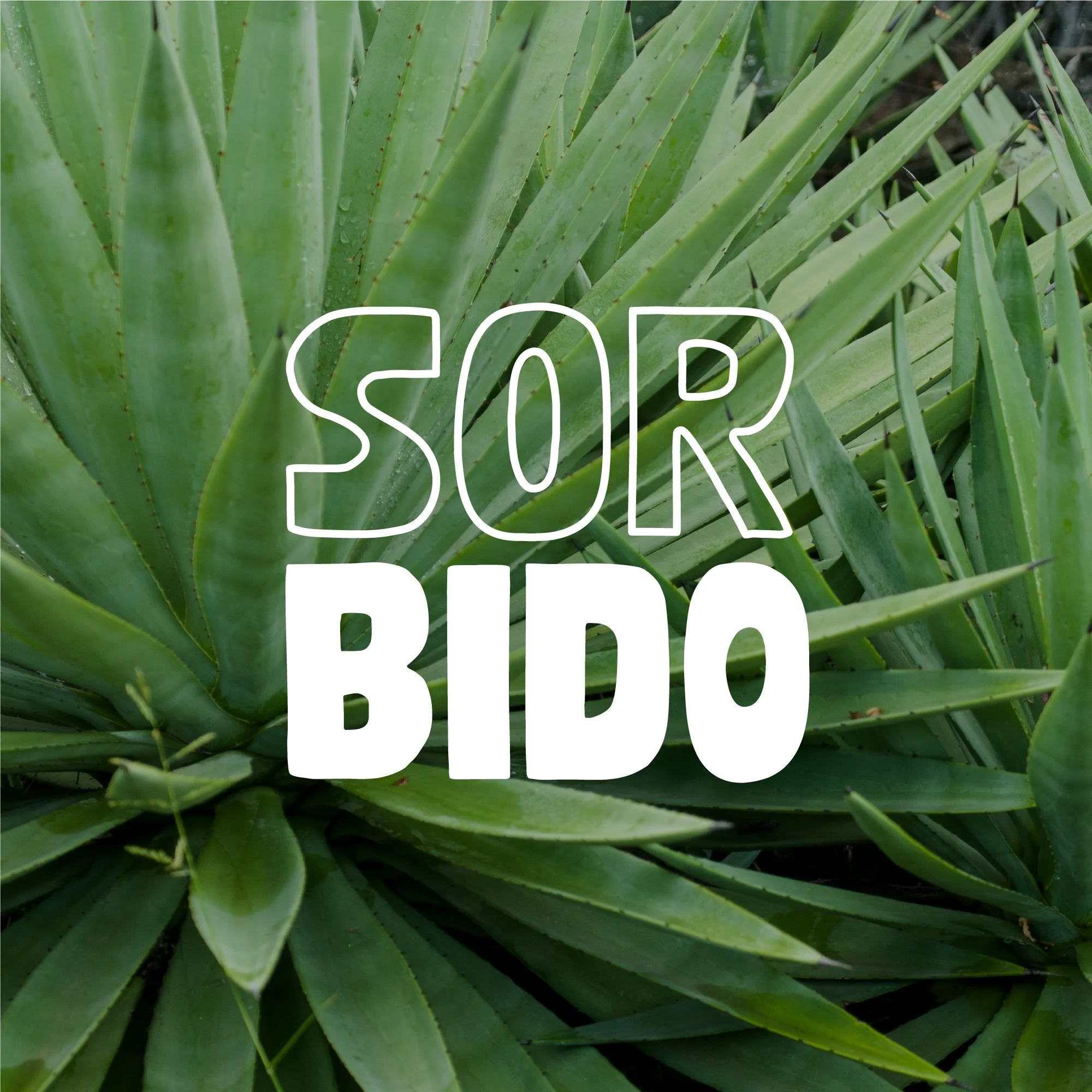
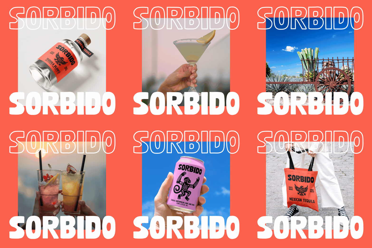
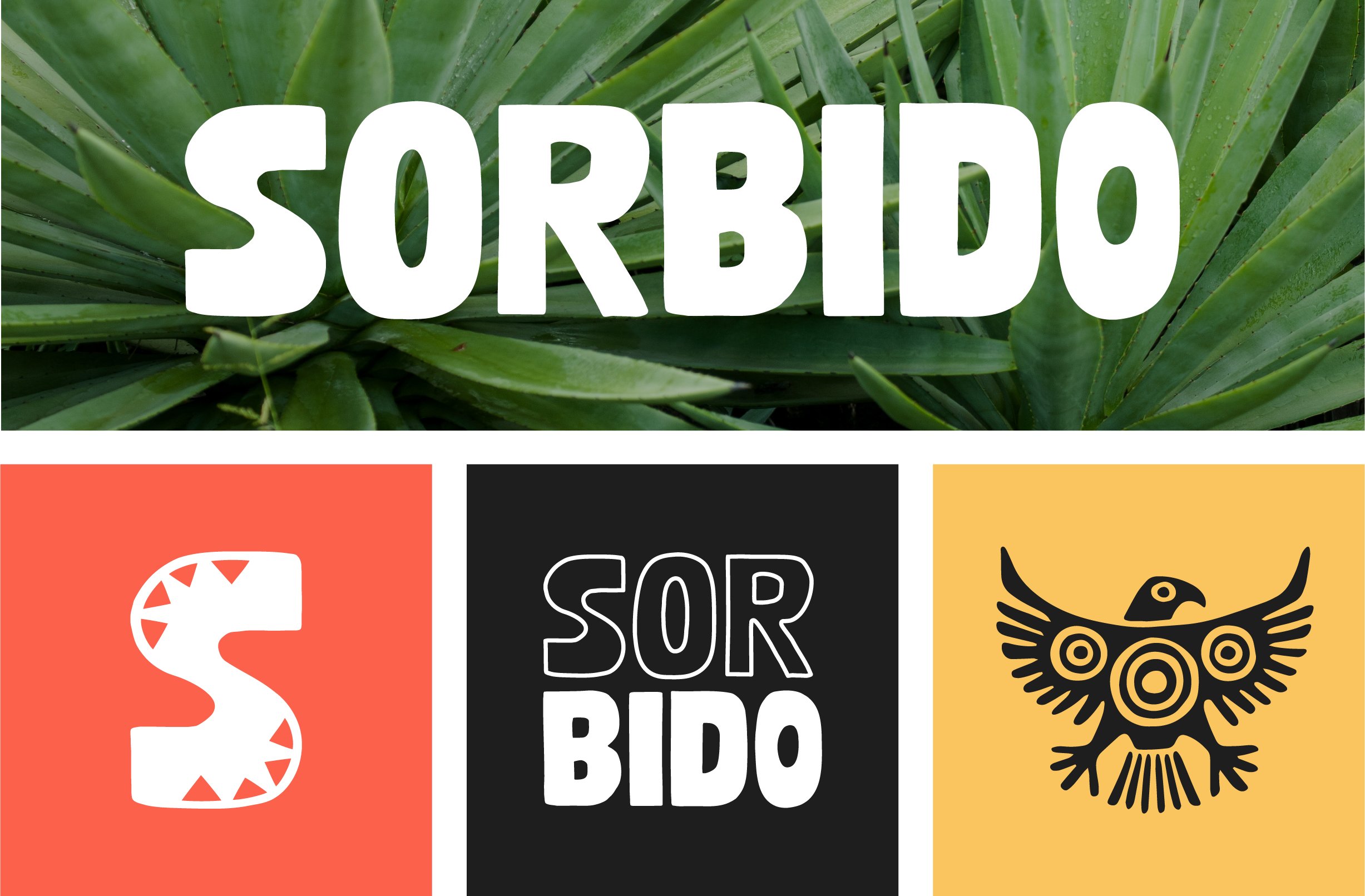
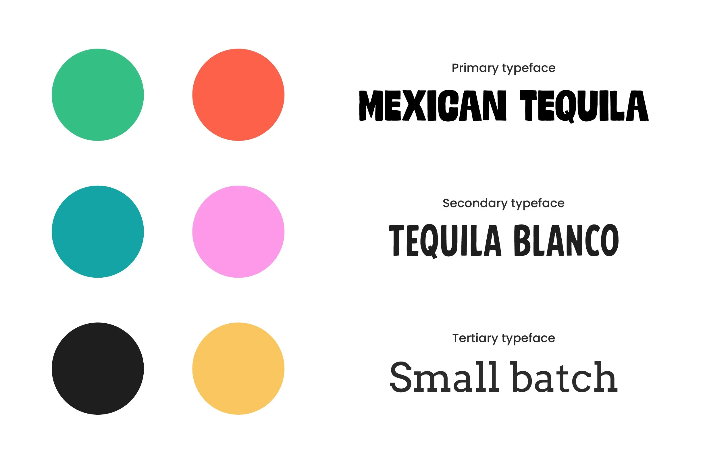
I developed the logo, typography, colour palette, and illustration style together so the identity would feel cohesive across every touchpoint. Loose, expressive forms influenced by Aztec visual culture carry through the branding and illustration, giving the system a distinctive sense of heritage while keeping it contemporary, energetic, and approachable.
Building a cohesive visual language
The identity and illustration system were developed in tandem so they would feel like parts of the same visual world.
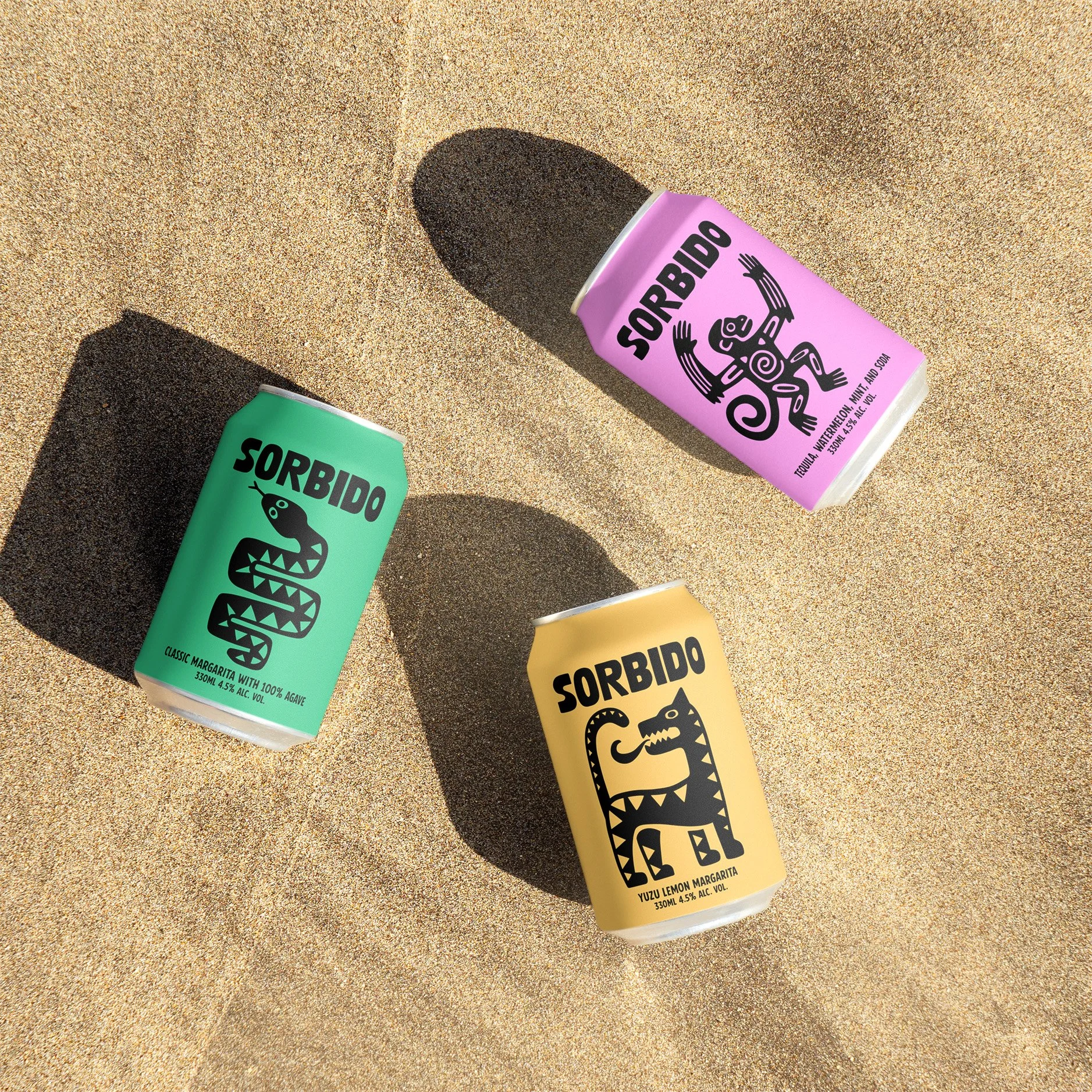
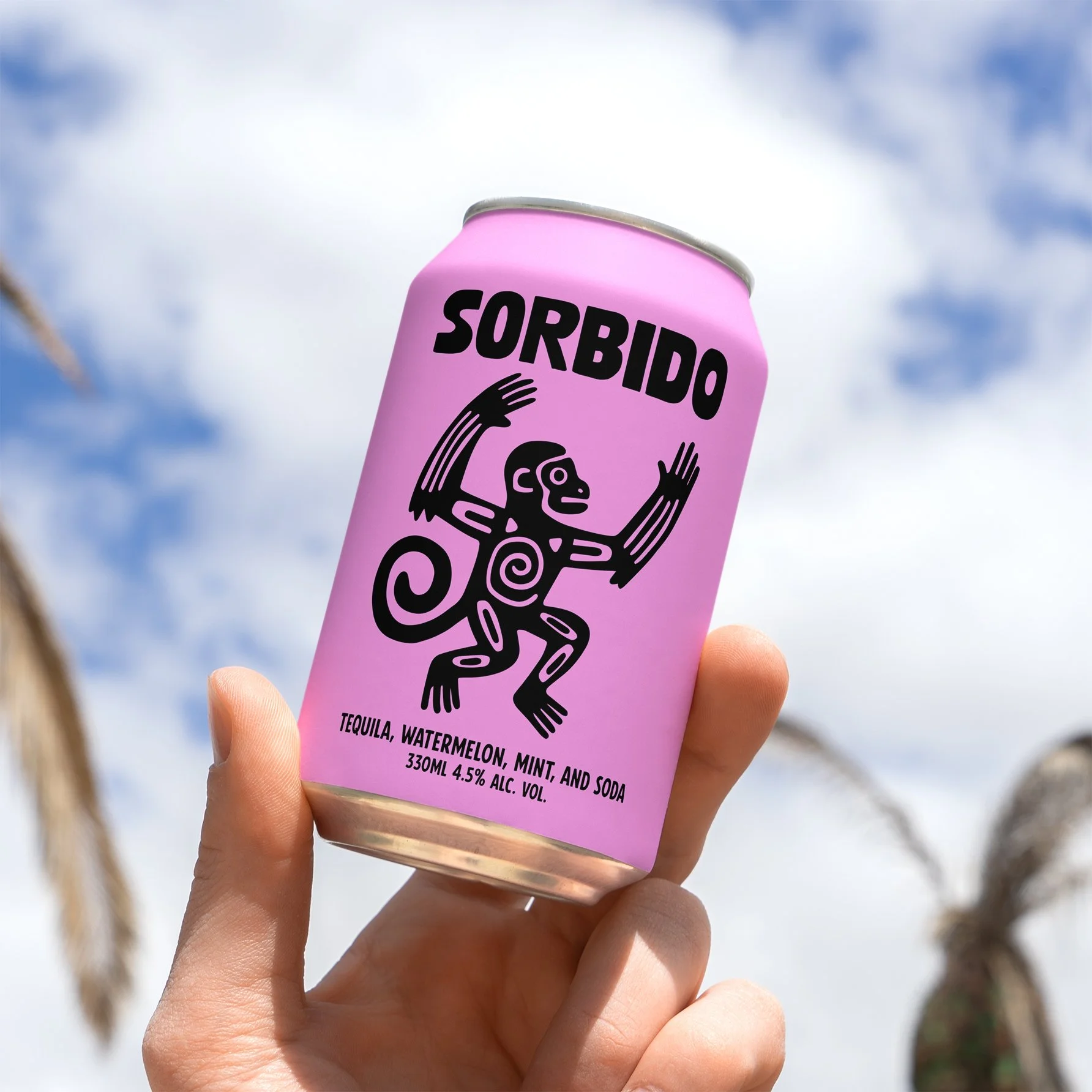
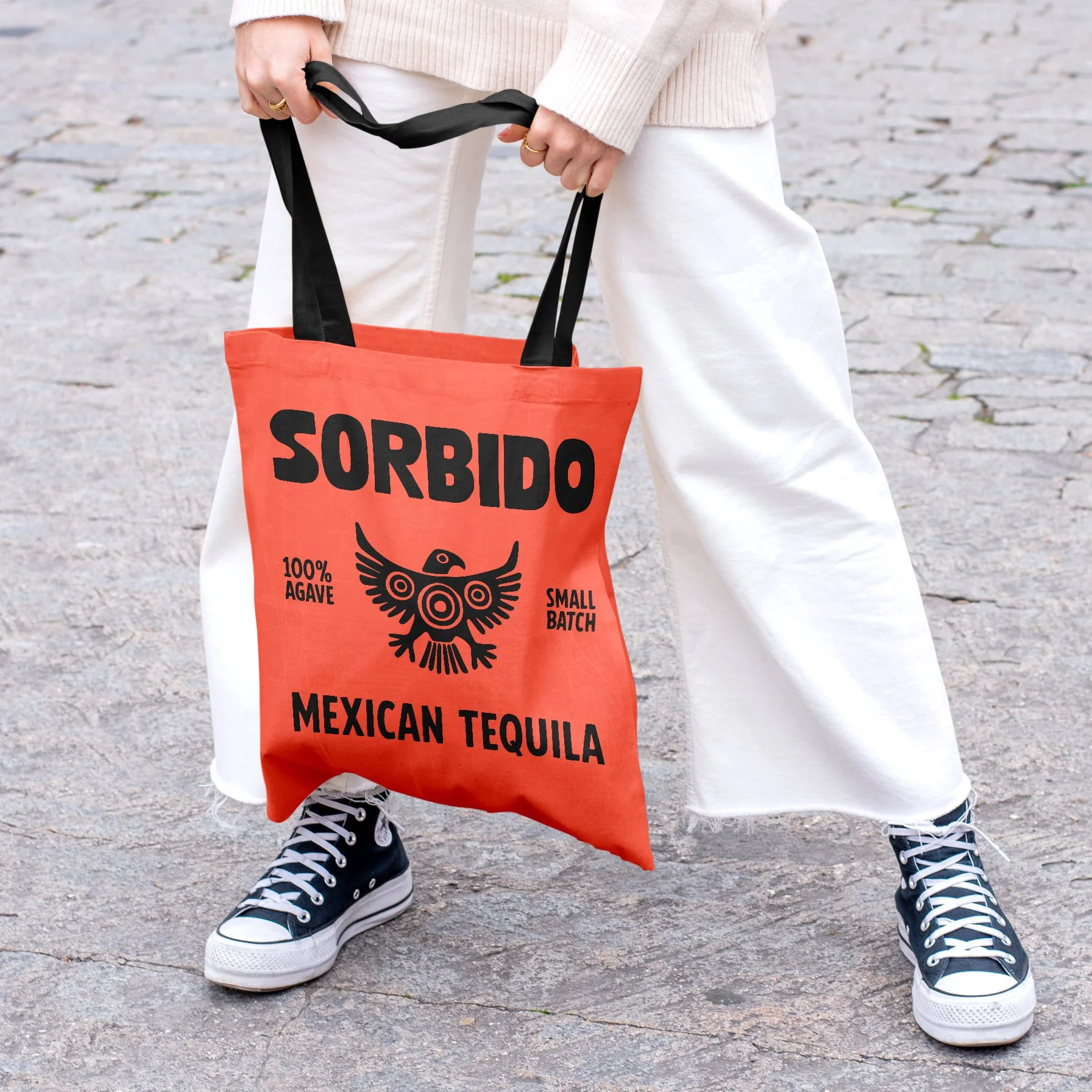
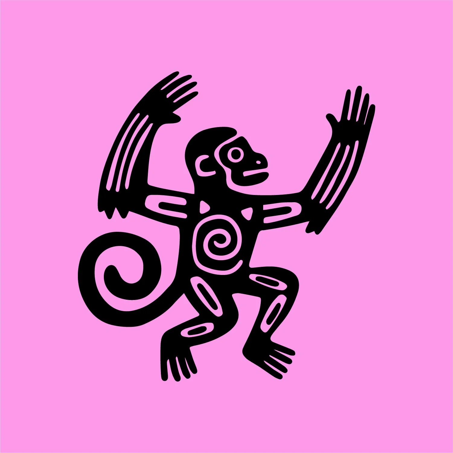
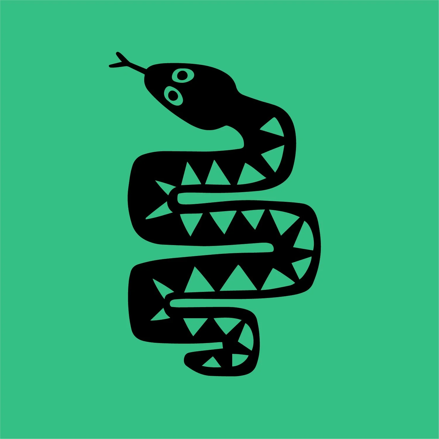
The logo, typography, colour palette, and supporting forms share the same loose, graphic character, creating a strong connection between the brand identity and the illustrations. Bright colour, bold silhouettes, and geometric pattern help give the system energy while keeping it recognisably Sorbido.
Developing the illustration style
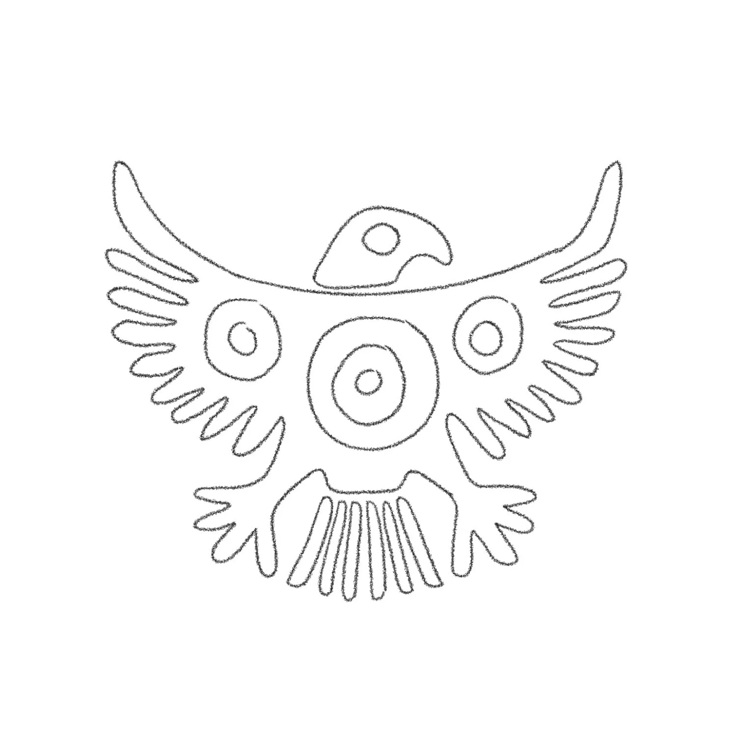
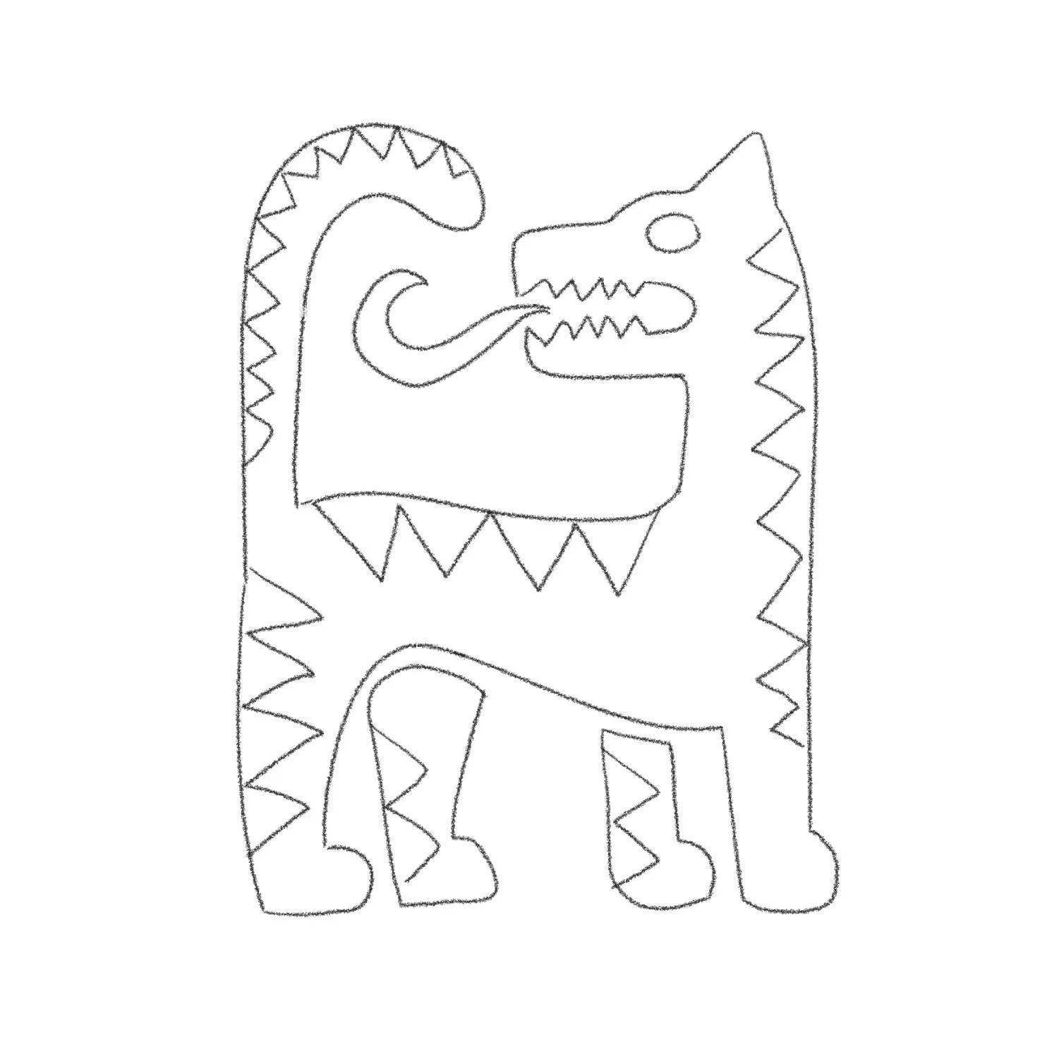
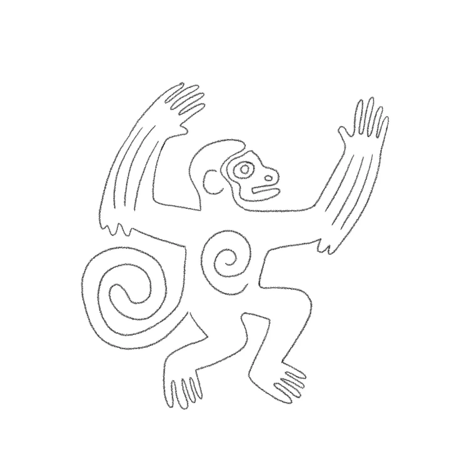
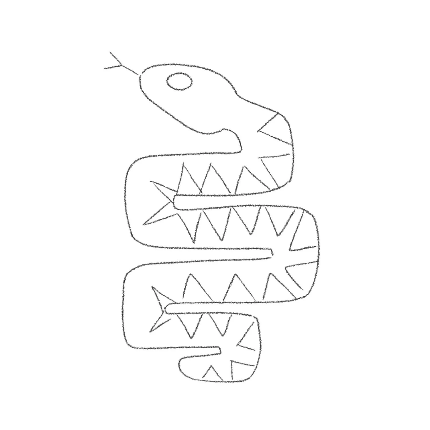
The illustrations began as loose pencil sketches exploring simplified animal forms, movement, pattern, and character.
The aim was to create something expressive and symbolic rather than highly literal, with enough simplicity to work confidently across packaging and brand applications.
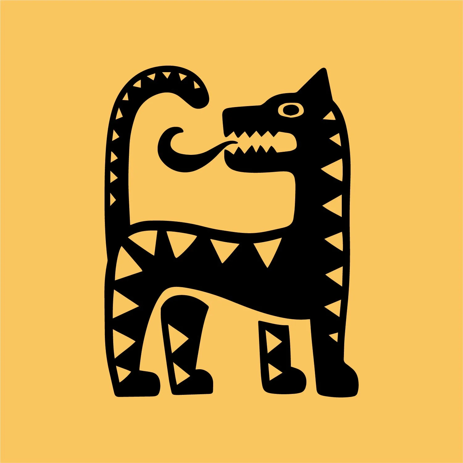
The final artwork keeps much of the character of the original sketches, using bold forms, graphic pattern, and hand-drawn irregularity to create a distinctive illustration language that feels naturally connected to the identity.

Bringing the brand to life
The Sorbido visual language was designed to work beyond the pack, extending across brand and marketing applications while keeping its sense of character and cohesion. From the identity through to the illustration system, every element was created to feel expressive, distinctive, and instantly recognisable.