10 Bold Packaging Designs to Inspire Your Next Creative Project
From maximalist colour pops to storytelling through stickers, here’s how brands are winning hearts (and shelf space).
Packaging design has come a long way from just being a container for a product. Today, it’s a storyteller, a sales tool, and a visual handshake all in one.
But with shelves (and Instagram feeds) more crowded than ever, how do you stand out?
The answer: go bold, go brave, go unforgettable.
Whether you’re branding a new product or reimagining an existing one, these 10 bold packaging designs show how strategic creativity, vibrant visuals, and storytelling details can capture attention—and loyalty.
1. Back to Nature – Snacks with a Sunlit Brand Voice

Tasty snacks with honest roots and a punchy look.
Back to Nature’s recent rebrand by LOVE reminds us that doing natural well doesn’t mean defaulting to muted tones. These redesigns inject vibrant colour, playful type, and retro energy — all while honouring the clean, wholesome identity the brand has built over decades. It feels joyful, grounded in its heritage, and above all visually striking on the shelf.
What stands out:
– A refreshed logo inspired by California sunrises, incorporating the brand’s iconic leaf motif.
– Vintage-style signwriting typography that nods to nostalgic screen prints.
– A palette of punchy, flavour-forward colours tied to specific products.
– Full redesign across SKUs with consistent tone, sticker accents, and photography that focuses on ingredient quality and “snackable” joy.Why it works:
It balances heritage + energy in a way that both long-time fans and new customers can connect with. The design doesn’t just show “natural” — it sells natural with personality, clarity, and visual confidence.
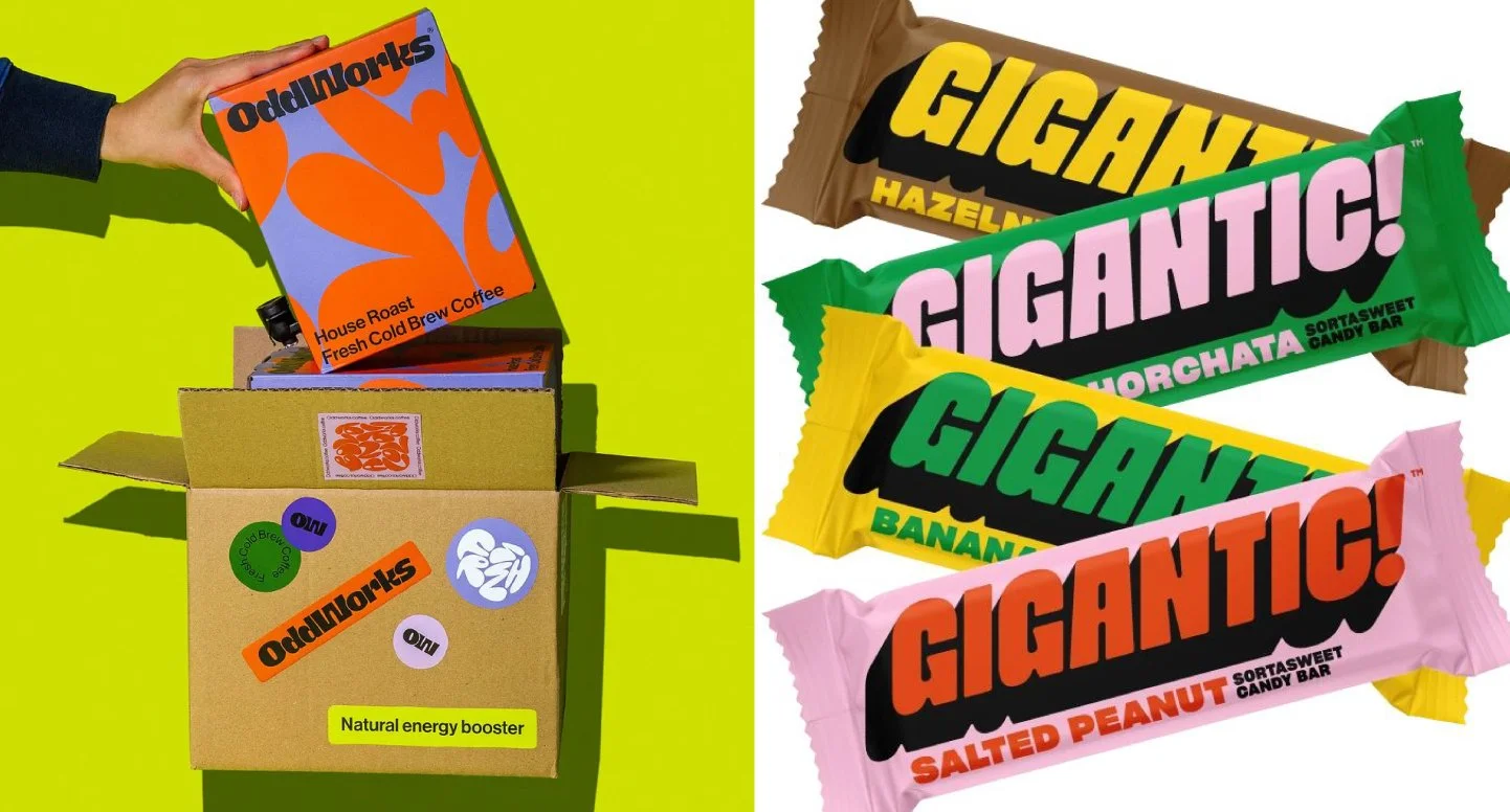
2. Oddworks Coffee – Energy in Every Inch
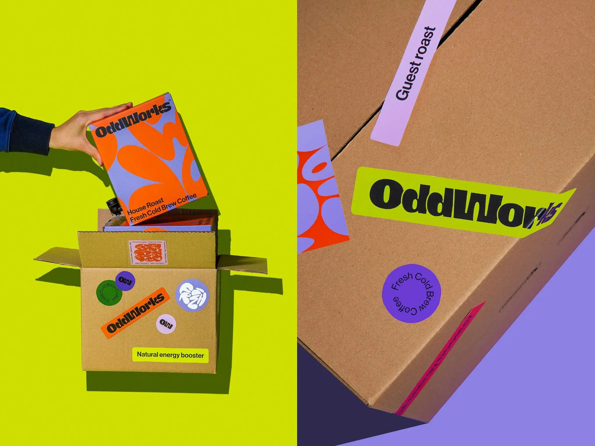
Fresh Cold Brew Meets Fresh Design.
Oddworks is bold, bright, and unapologetically different. From the groovy orange-on-lilac typography to the layered sticker system, this coffee box bursts with energy before you even take a sip.
What stands out: Retro-futuristic font choices, oversized sticker branding, flat fluorescent backdrop for standout product photography.
Why it works: It communicates flavour, personality, and purpose in one glance. You know it’s not your average brew.
3. Who Gives a Cr*p – Toilet Paper, Rebranded

Not just good for you. Good for the planet.
Who Gives a Cr*p turns the most mundane household product into a design-led mission. Bright, patterned wraps and witty copy give toilet paper a total brand glow-up.
What stands out: Bold colours, cheeky tone of voice, environmentally-conscious messaging.
Why it works: It's a masterclass in turning necessity into brand affinity. Every roll becomes a talking point (and Instagrammable moment).
4. Neeo Vitamins – Science-Backed Meets Aesthetic-Forward
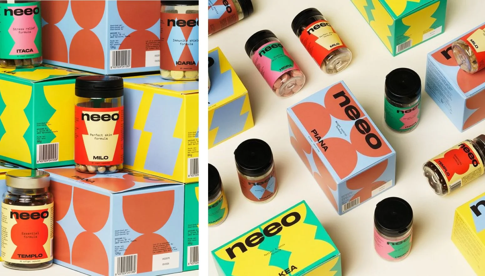
Vitamins, but make them beautiful.
Neeo reimagines the supplement space with packaging that looks like a designer perfume box. Gradient finishes, clean type, and functional elegance give it both credibility and shelf appeal.
What stands out: Subtle metallic finishes, soft gradient accents, sleek typography, and colour-coded systems.
Why it works: It feels like luxury wellness without losing approachability—great packaging for products that live on kitchen counters, not inside cupboards.
5. Denada Ice Cream – Less Sugar, More Style

Real flavour, zero compromise.
Denada’s packaging uses confident colour blocking, strong serif type, and minimal elements to capture the premium quality of its no-sugar-added ice cream range.
What stands out: Simple yet impactful palettes, bold font pairings, matte finishes.
Why it works: Denada feels indulgent and health-conscious at the same time—a visual balance that mirrors its product proposition.
6. Sammontana Bis! – Whimsy Meets Italian Cool

Gelato that makes you grin.
Sammontana’s Bis! range is delightfully loud. With playful type, vintage colour palettes, and character-driven illustrations, it’s fun, nostalgic, and deliciously distinctive.
What stands out: Dynamic graphics, oversized lettering, retro vibes with a modern twist.
Why it works: It taps into joy and indulgence, drawing on Italian summer nostalgia to stand out in the freezer aisle.
7. Bezi – Sleek and Snackable

Gut-friendly design with edge.
Bezi reimagines a traditional Middle Eastern dairy staple with bold, retro-inspired packaging that feels modern, fun, and instantly memorable.
What stands out: Chunky, playful typography grabs attention and conveys personality while staying legible. The vibrant flat illustrations draw consumers in while also adding flavour cues - like dripping honey or a sesame bagel - making the product clear at a glance.
Why it works: Bezi balances tradition with boldness, turning an everyday staple into something that feels exciting, approachable, and fresh. The packaging communicates both flavour and fun, encouraging shoppers to pick it up and try something new.
8. Gigantic Chocolate – Treats With a Bold Bite
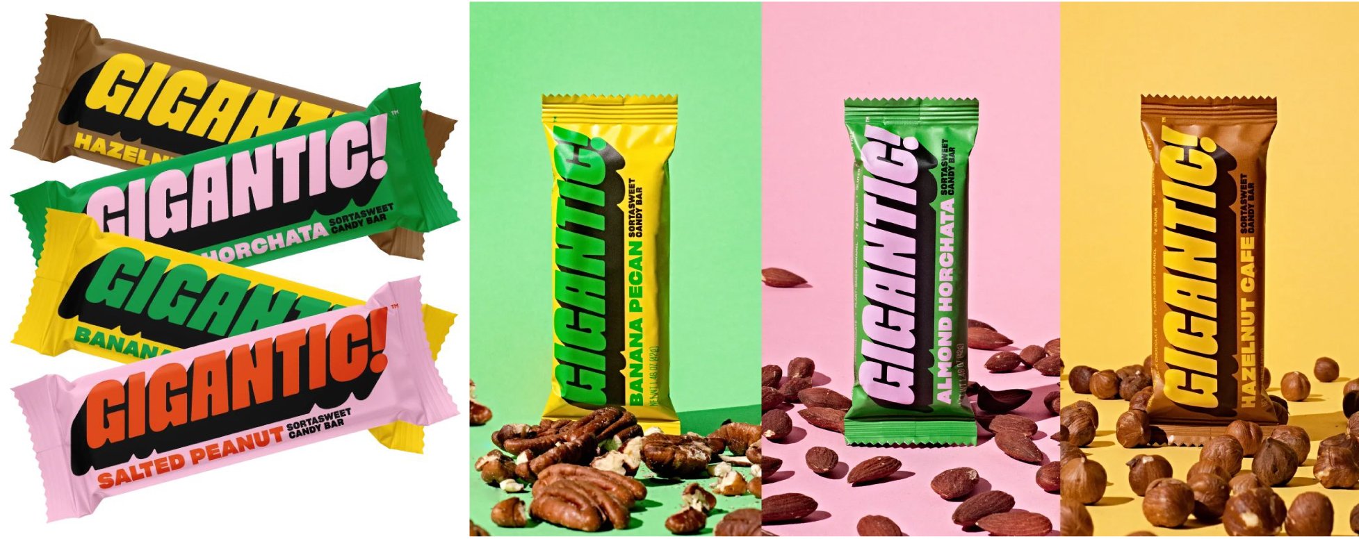
Candy bars that go big on flavour, design, and values.
Gigantic makes vegan chocolate bars that ditch the sugar rush for flavour-forward indulgence—and the packaging is just as punchy. Think vivid type, playful illustrations, and an irreverent tone that’s made for modern snackers.
What stands out: Oversized typography, maximalist wrappers, and energetic colour blocking.
Why it works: It repositions candy bars for a new generation—focusing on flavour, fun, and feel-good ingredients. Gigantic’s bold packaging and mission-driven messaging combine to create a strong emotional hook.
9. Tomatier Snack’s Cherry Tomatoes – Tomato Monster Box!

Snack-sized. Monster-sized personality.
Tomatier redefines healthy snacking with a delightfully weird packaging concept—a tomato monster box. It’s equal parts playful and practical, and impossible to ignore.
What stands out: Die-cut monster design, interactive opening mechanism, illustrated tomato characters.
Why it works: It's storytelling in structural form. The packaging is fun for kids, cool for adults, and reinforces freshness and whimsy.
10. Oatly – The Brand That Made Oat Milk Cool

How clever packaging turned a 30-year-old company into a global sensation.
Oatly isn’t new—it was founded in the 1990s. But it wasn’t until their now-iconic rebrand by Swedish agency Forsman & Bodenfors that they became a household name.
Their packaging turned heads with hand-drawn fonts, deadpan humour, and bold block layouts. The cartons talk to you in a voice that’s unpolished, cheeky, and unmissably human. In a sea of “clean” food brands playing it safe, Oatly made oat milk loud, irreverent, and actually fun.
What stands out:
– Conversational copy that breaks the fourth wall ("Wow no cow!")
– Rough-hewn typography and illustration that feel intentionally awkward
– Monochromatic, minimalist layouts with unexpected design choices
– Unified tone across packaging, ads, website, and even investor materialsWhy it works:
Oatly proves that packaging isn’t just about looking pretty—it’s a voice, a vibe, and a strategy. Their carton doesn’t whisper “sustainable alternative”... it screams personality in a way that made oat milk a cultural moment.
Takeaway for creatives: Even legacy brands can reinvent themselves—and packaging can be the megaphone.
Final Thoughts: Bold Isn’t Just About Colour
Yes, these brands use big type, bright hues, and fun illustrations, but that’s not what makes them truly bold.
The real secret? Strategic storytelling.
Every sticker, colour choice, and font was made with purpose; whether that’s to spark joy, build trust, or drive sales.
So if you’re working on a product or rebrand, remember this:
Bold design isn’t about being loud. It’s about being unforgettable.
And if you need a creative partner who brings strategy and visual punch to the table? Let’s chat.