6 Seasonal Colour Palettes to Inspire Your Next Creative Project
Colour is one of the most powerful tools in any creative project. The right palette can instantly set the tone, evoke emotion, and bring your designs to life. Whether you’re working on branding, illustration, packaging, or social media graphics, drawing inspiration from seasonal colour palettes is a simple way to keep your work feeling fresh and relevant.
Here are six seasonal palettes—each inspired by a distinct mood and setting—to spark your next project.
1. Summer Carnival

Palette: Carnival (#E33E00), Boardwalk Sand (#F7F1DD), Ocean Horizon (#1F77A8), Summer Breeze (#2C9DB7)
Inspired by seaside boardwalks and fairground rides, this palette combines warm reds with breezy blues. It’s perfect for designs that need to capture energy, playfulness, and nostalgia.
Why it works:
Bold contrasts keep the palette eye-catching.
The balance of warm and cool tones feels both fun and versatile.
Works beautifully for event posters, festival branding, or playful packaging.
2. Autumn Escape
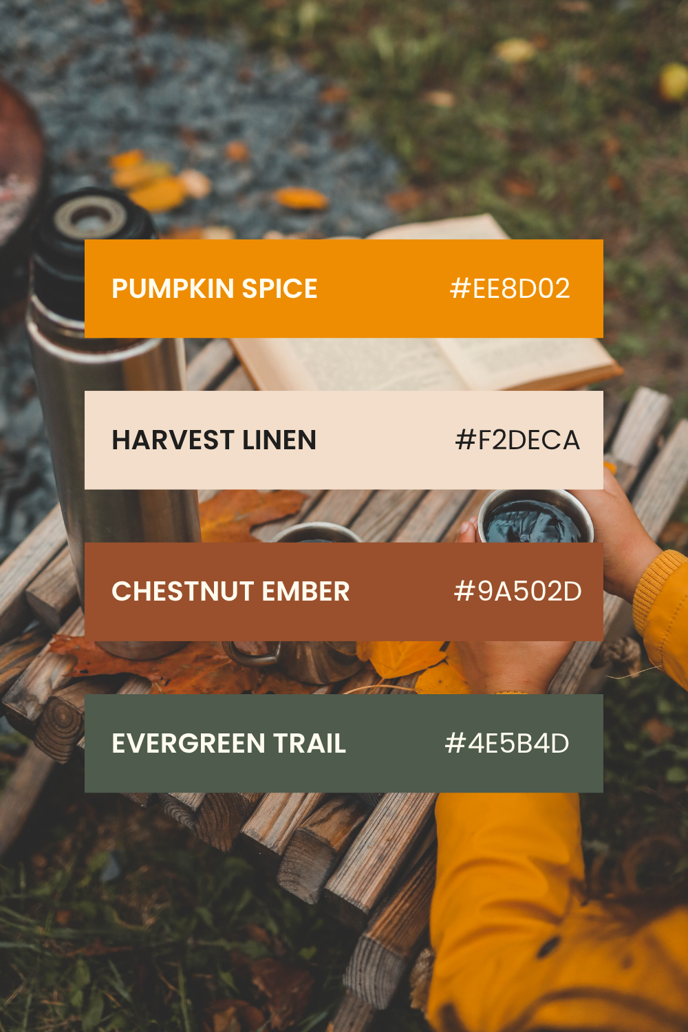
Palette: Pumpkin Spice (#EE8D02), Harvest Linen (#F2DECA), Chestnut Ember (#9A502D), Evergreen Trail (#4E5B4D)
Think crisp mornings, hot drinks, and leaves underfoot. This autumn palette is earthy yet warm, with a perfect balance of neutrals and deep tones.
Why it works:
Rich oranges and browns evoke seasonal warmth.
The grounding green balances the warmth for more sophistication.
Perfect for cosy branding, seasonal campaigns, and editorial spreads.
3. Tropical Sunset

Palette: Coconut (#FFEECF), Sunset (#FFBC33), Coral Reef (#FF7E3F), Lagoon Blue (#1CA0C0)
Bright, bold, and joyful, this palette is a celebration of summer evenings and beach escapes. The vibrant coral and sunset yellow contrast beautifully with the cool lagoon blue.
Why it works:
Perfect for bold, modern packaging and social media graphics.
The tropical feel makes it ideal for food, beverage, or travel brands.
Vibrant tones grab attention and exude positivity.
4. Citrus Splash

Palette: Peach Fizz (#FFEABD), Golden Zest (#FFC63A), Coral Crush (#FF8754), Blood Orange (#F74E27)
Fresh and zesty, this palette is inspired by the brightness of citrus fruit and summer drinks. It’s energetic, playful, and perfect for projects that need a refreshing twist.
Why it works:
Harmonious shades of orange with subtle tonal variety.
Bright yet cohesive for high-impact visuals.
Great for food brands, wellness products, or lively event design.
5. Floral Romance
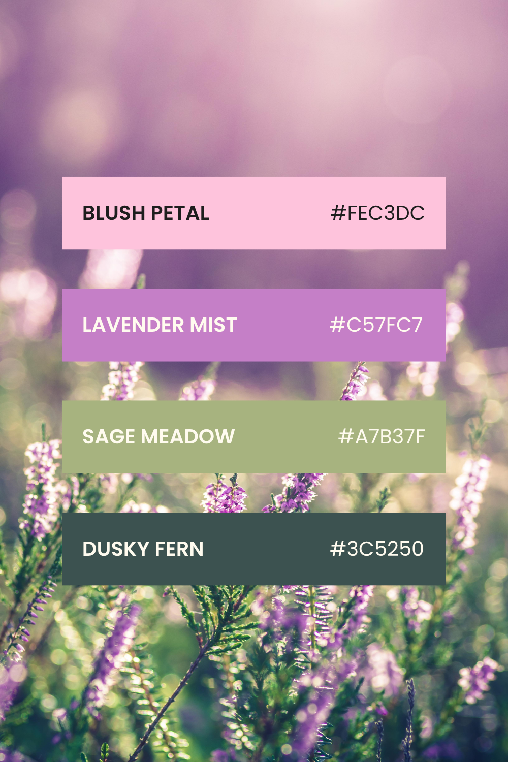
Palette: Blush Petal (#FEC3DC), Lavender Mist (#C57FC7), Sage Meadow (#A7B37F), Dusky Fern (#3C5250)
Soft and elegant, this palette blends pastel pinks and purples with grounding greens. It’s perfect for designs that need a delicate, romantic touch.
Why it works:
Combines feminine softness with earthy grounding.
Works well in fashion, beauty, or wedding-themed projects.
Adds subtle sophistication without losing vibrancy.
6. Winter Neutrals
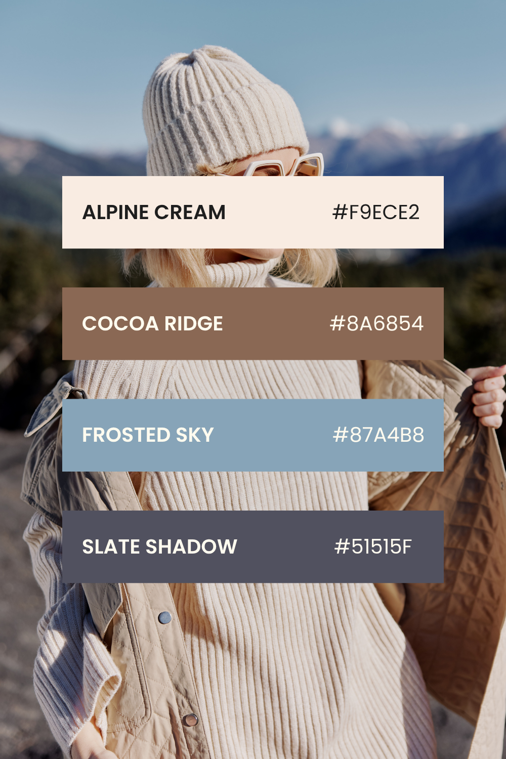
Palette: Alpine Cream (#F9ECE2), Cocoa Ridge (#8A6854), Frosted Sky (#87A4B8), Slate Shadow (#51515F)
Cool, muted tones inspired by winter landscapes. This palette balances creamy neutrals with icy blues and deep shadows, perfect for a calm, refined aesthetic.
Why it works:
Minimalist yet sophisticated.
Evokes feelings of stillness and quiet strength.
Ideal for editorial layouts, interior design, or luxury branding.
Wrapping Up
Seasonal colour palettes are more than just inspiration; they can set the entire mood of a project. Whether you’re going for bold and vibrant, soft and romantic, or grounded and sophisticated, using palettes like these ensures your work connects with the emotions of the season.