Design Is Communication: Why Every Visual Decision Sends a Message
There’s a moment in every designer’s journey where you realise the work isn’t really about making things “pretty.” It’s not even about aesthetics. It’s about clarity, and whether someone, somewhere, understands what you were trying to say without you needing to explain it.
This is the shift that turns a designer from a decorator into a communicator.
It’s subtle, but it changes everything: how you approach briefs, how you justify creative decisions, how you speak to clients, how you evaluate your own work, and ultimately how successful your designs become.
Design isn’t decoration; it’s communication. When you understand that, your work becomes significantly more powerful.
Pretty Isn’t the Goal. Clarity Is
Beautiful design can absolutely capture attention, but if the message doesn’t land, the design hasn’t done its job. That’s the difference between art and design: art expresses; design communicates.
When designers approach a project as a communication tool rather than a visual exercise, everything shifts:
colours stop being “what looks nice” and become “what creates meaning”
typography becomes a voice, not an ornament
layout becomes a logic system, not a grid to fill
visuals become strategic decisions, not decoration
creative choices serve a purpose, not a preference
Good design draws you in.
Great design tells you something: quickly, clearly, and intentionally.
Why Good Design Starts With the Problem, Not the Visual
The biggest mistake designers make early in their careers is jumping straight into execution. We open Illustrator, build a moodboard, and start sketching concepts before fully understanding what the design actually needs to do.
But communication happens when the visuals respond to a problem.
Ask better questions, and you create better outcomes:
What does the audience need to understand immediately?
What emotion do we want to evoke?
Where will this design live?
What decisions should the design guide someone toward?
What story does the brand need to tell?
What barriers stop the audience from understanding the message?
Design becomes clearer and more effective the moment you understand the problem you’re trying to solve.
A Real-World Example: Back to Nature's Rebrand
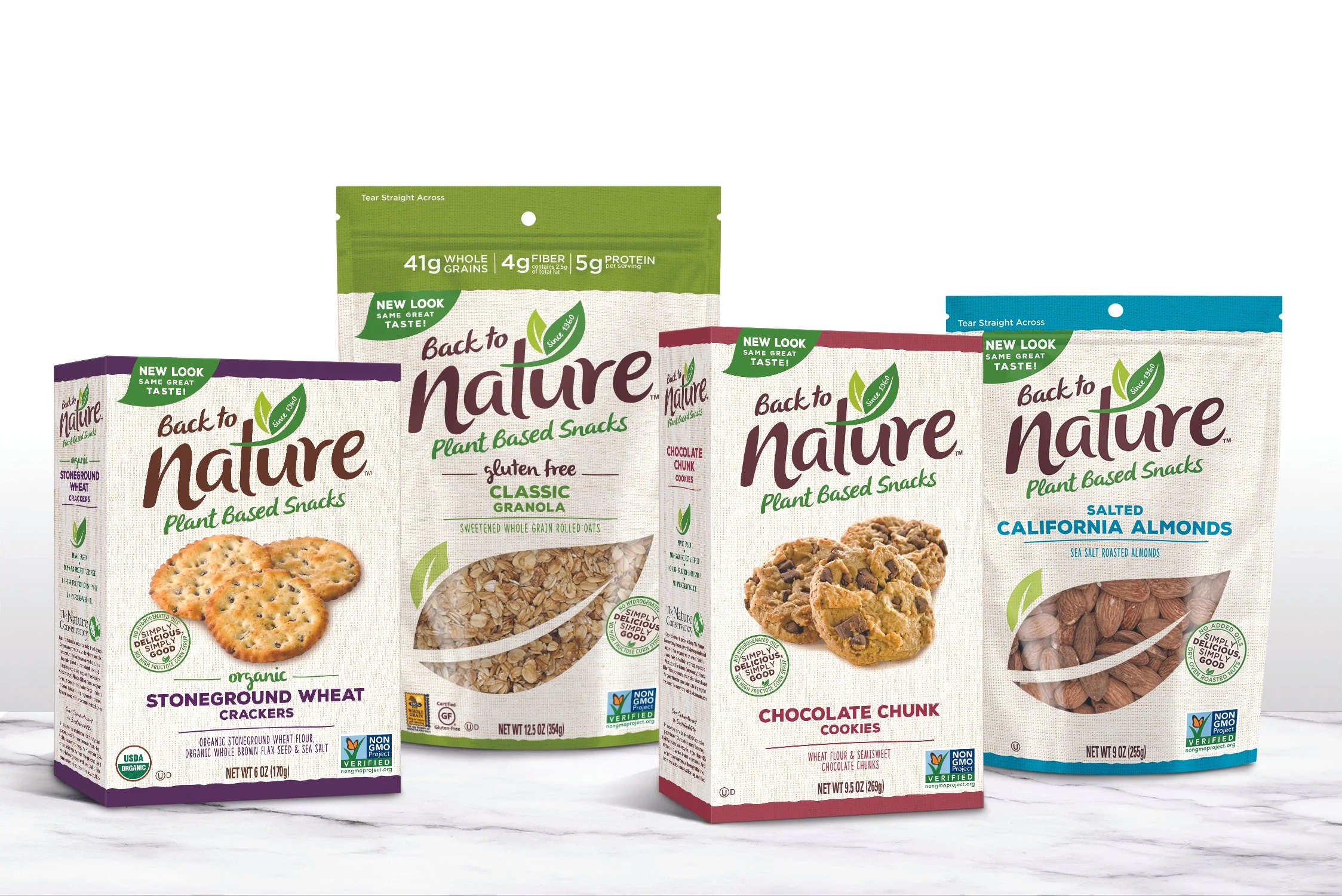
The packaging and branding before (above)
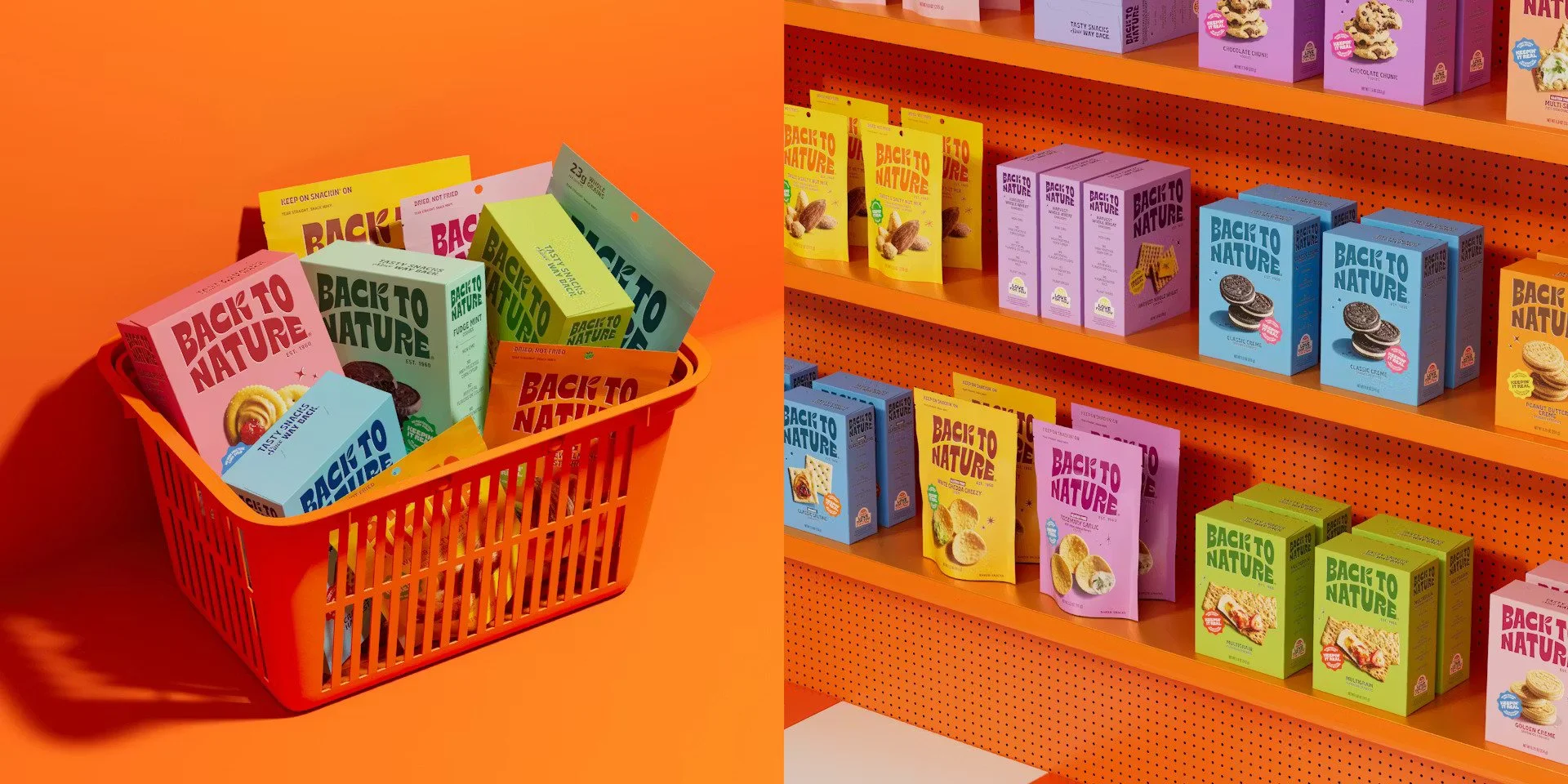
The new refreshed brand and packaging by LOVE creative (above)
Back to Nature is a US snack brand with over 60 years of history. For decades, it had earned a loyal following by remaking classic snacks with better, cleaner ingredients. The product was genuinely good. But the design? It had fallen behind.
Sales were suffering. Subdued packaging and messaging had the brand sitting on the dated, duller side of healthier snacking, while competitors (including supermarket private-label lines) were investing heavily in visual identity. The product hadn't changed. The communication had simply stopped doing its job. LOVE
Manchester-based agency LOVE was briefed to revitalise the brand to drive consumer awareness in an increasingly saturated market, with a strategy built around making the brand feel "full of" rather than "free-from." World Brand Design Society
Every creative decision that followed was rooted in communication, not decoration:
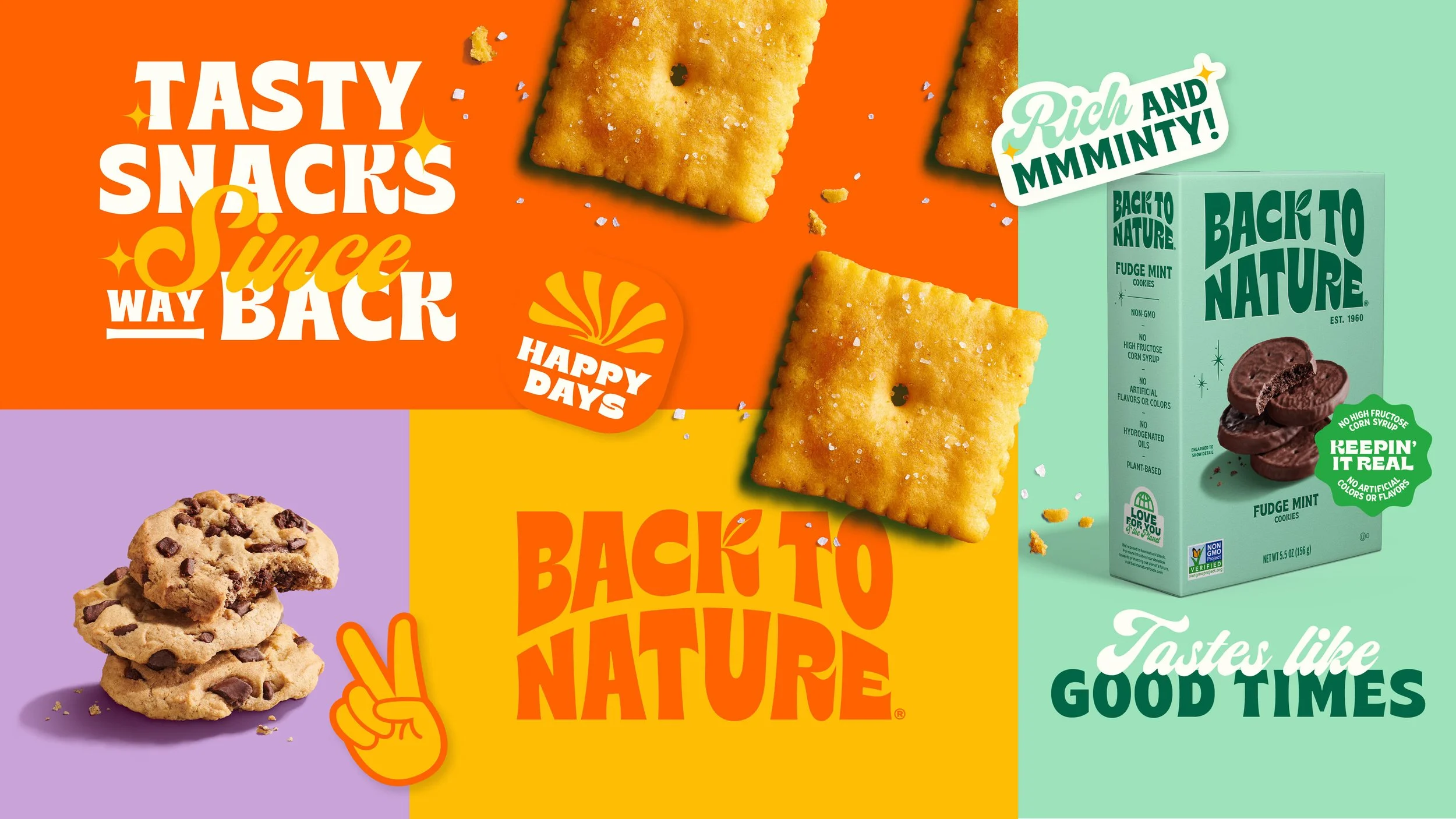
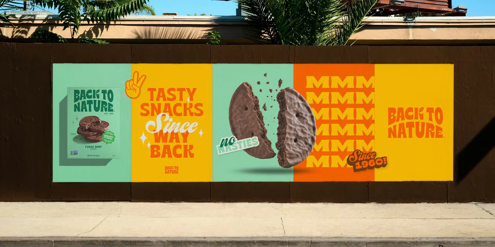
Colour: A palette of vivid, punchy colours was chosen for its visual links to the West Coast, immediately signalling warmth, energy, and heritage without a single word. Creative Boom
Typography: Typography tapping into vintage-style sign writing, reminiscent of old-school screen prints, gave the brand a voice that felt nostalgic and confident at the same time. Packaging News
Tagline: A new line, "Tasty Snacks Since Way Back," paired with a confident, easy-going tone of voice that highlights the brand's rich history while making it approachable and current. Packaging News
Audience focus: The rebrand targeted a newly defined audience of "Snack Surfers," real people browsing the aisles, with a modern retro identity that channels the laid-back spirit of 1960s California. Packaging News
Almost a complete overhaul, one asset was deliberately kept from the original branding: the iconic leaf. A considered nod to Back to Nature's role in kick-starting the natural foods movement. LOVE
The result was a brand that communicated its personality instantly, on shelf, across packaging, and in every touchpoint. Not because it looked nicer, but because every single decision served the message.
That's what strategic design looks like in practice.
Design Choices Are Communication Tools
Every design decision sends a message, whether intentional or not. The most successful work comes from being deliberate about those messages.
Colour
Colours hold psychological, cultural, and contextual meaning. They’re not decorative. They’re emotional cues.
Typography
Fonts speak: Bold is confident. Serif is trustworthy. Wide tracking feels airy. Tight tracking feels urgent.
Typography shapes voice as much as the copy does.Composition
Where things sit, how they balance, how they direct the eye: it all communicates hierarchy, importance, and direction.
Imagery & Illustration
Every illustration style sends a signal: playful, editorial, corporate, expressive, nostalgic. Imagery sets tone long before anyone reads a word. If you want to go deeper into how illustration supports brand awareness, you’ll love this blog post.
Spacing & Pacing
The breathing room inside a design communicates intention just as loudly as what fills the space.
When these elements work together intentionally, design becomes clear, meaningful, and effective.
If Your Audience Doesn’t Understand It, It Doesn’t Work
This is the test I always come back to:
If someone can’t tell what you want them to feel, understand, or do, the design is not finished.
It might be beautiful, clever, and technically perfect, but if the message isn’t clear, it’s still decoration.
Clients don’t hire designers for decoration; they hire them for communication. And when you position your work this way, you elevate your value and your expertise.
Design That Communicates Builds Trust
Clients often feel overwhelmed by the design process because they’re not sure what they’re looking at. When you make communication your priority, you make the process clearer, the decisions easier, and the outcomes stronger.
You stop being “the designer who makes things look nice” and become:
the partner who helps them articulate their message
the strategist who simplifies complexity
the collaborator who understands their audience
the expert who makes decisions for a reason
the communicator who helps their brand feel understood
This is where trust builds. This is where clients stay.
How to Start Designing With Intention (Not Decoration)
Here are practical, accessible shifts that immediately strengthen your design work:
Start With Words, Not Visuals
Understand the message before choosing the medium.
Ask “Why?” For Every Design Decision
If the only answer is “it looks good,” keep digging.
Prioritise Hierarchy
If everything is loud, nothing is heard.
Simplify the Story
If the message is complex, the visual system needs even more clarity.
Design for the Audience, Not Yourself
Your taste matters, but their needs matter more.
Critique Your Own Work Through a Communication Lens
“Is this clear?” is always a more useful question than “Is this pretty?”
Communication Is the Designer’s Real Superpower
When you start seeing design as a communication system your work becomes clearer, more strategic, and far more effective. You create work that informs, engages, guides, and connects.
Clients notice, audiences feel it, your confidence grows, and your creative decisions gain weight.
Design isn’t here to be ornamental. It’s here to help people understand something: quickly, clearly, and beautifully.
That’s far more powerful than “pretty” could ever be.